Aggregated Pareto Chart gadget
NOTE: This gadget is part of the Energy Analysis Dashboards Module. This Module requires a separate license.
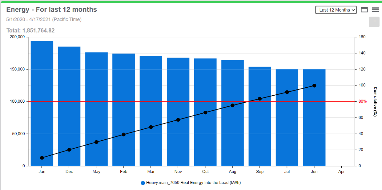
This gadget shows consumption data for multiple consumers, over a selected time period. The information is shown in a combined column and line chart, grouped by aggregation period. The columns are arranged from highest consumption to lowest consumption. The chart includes a cumulative curve based on the aggregation period consumption values. The chart also contains a configurable marker line which is used as a target or threshold indicator.
Use this gadget to perform an 80/20 analysis, identifying those aggregation intervals and consumers that together make up the largest portion, or 80% of the overall consumption.
TIP: This gadget supports printing its complete data set and exporting its complete data set in PNG, JPG, SVG, CSV, and HTML format directly from the Web browser. To export the data, hover the mouse pointer over the download icon ![]() in the gadget and select Print or the desired format from the pop-up menu.
in the gadget and select Print or the desired format from the pop-up menu.
Example:

For information about configuring the gadget, see Configuring Gadgets.