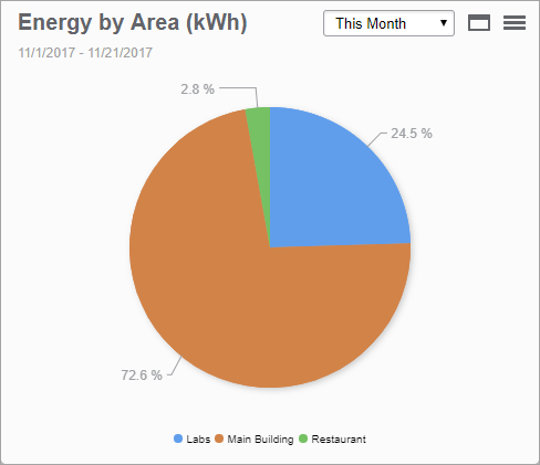
This gadget shows a comparison of several data series in a single chart, over a selected time period. The information is shown in a pie chart, as a percentage distribution of the different data series.
Example:

TIP: Place your pointer on a section in the chart to open a tooltip showing the measurement value. Click a section in the pie to separate it from the pie. Click a series in the legend to hide or show this series in the chart.
For information about configuring Power Quality gadgets, see Configuring Gadgets.