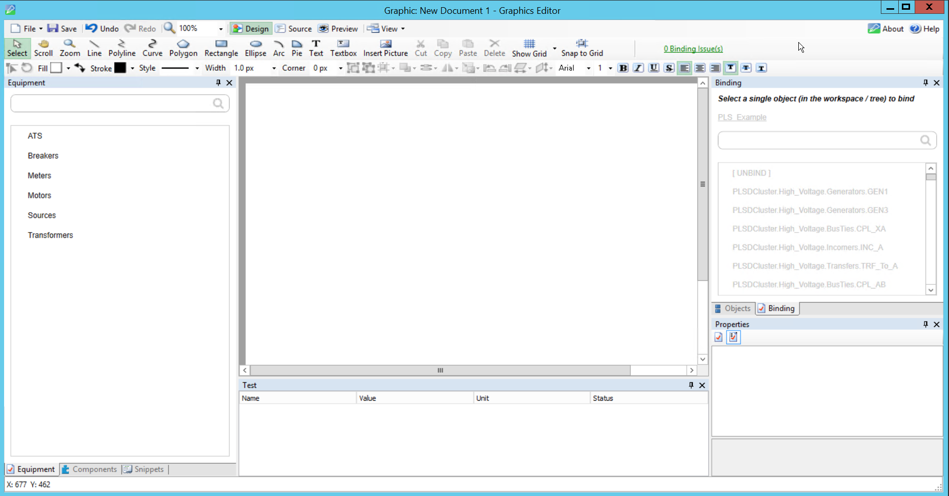
Using Graphics Editor
Graphics Editor contains tools to make geometrical figures, symbols, texts, flexible data conversions, animations, dynamics, and interactivity. You can transform, move, align, arrange, and distribute graphics objects in a work area in several ways.
Standard symbols and components representing common functions are available in libraries delivered with Graphics Editor. You can add to these libraries.
You can open and import graphics or photographs into Graphics Editor, paste graphics into other graphics, and export from Graphics Editor.
Components
A graphic component is a predefined graphic that contains one or several other parts. Components are meant for reuse and typically represent a feature or a device in a live system. Components can be designed as symbols which can be used as building blocks and reused in several graphics. Components reside in dedicated libraries and are displayed in the Components pane. The analog watch is an example of a component.
Working with components
When you design components, it is recommended that you set Graphics Editor Component mode to Graphics.
When you create a new component, the default work area is 200x200 pixels (where a pixel is the smallest possible drawing unit). A standard graphic work area is 600x800. This smaller work area is usually sufficient to draw a fairly detailed component. When you use the component in the TGML graphic, however, the component is automatically scaled to one fifth of the graphic size. This default size of 40x40 pixels makes the component comparable in size to the ISO and DIN standard components.
For more information, see the TGML File Format section.
ComponentContent elements
When you create a component, the root element, ComponentContent, is used (instead of TGML for a graphic object). When the component is stored in a library and used in a graphic, the ComponentContent element is replaced with the Component element.
The root element of a component always includes at least two metadata elements describing the component: Name and Description. These metadata elements automatically get their values when you save the component.
The ComponentContent has the following properties:
- Opacity
- Visibility
- Height
- Width
The height and width values are copied to the ComponentHeight and ComponentWidth properties of the Component element when you store the component. When you use the component in a TGML graphic, however, the height and width values are scaled to 20%, as mentioned previous.
Thus, the component has one size when you use it in a graphic and another size (usually larger) when you create or edit the component.
Managing components
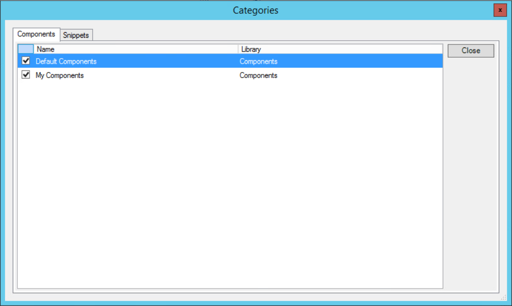
Components are stored as separate files in subfolders of the Components folder. Typically, you would save different categories of components in different subfolders. The subfolder names are displayed as separate bars in the Components pane.
Creating components
You can create and import components in several ways:
- Create a new component in Graphics Editor Component mode
- Group and save as a component in Graphics Editor Graphic mode
- Import components from an external source
You can create graphics that you edit in Graphics Editor. Graphics consist of one or several graphic objects. You can set properties for the graphic objects to define their appearance and behavior.
You can create the graphic objects by using the drawing tools, by copying objects from the work area, or by using instances of objects from the libraries delivered with Graphics Editor.
All drawn objects belong to one of the following two groups:
- Graphics: Free-form drawings
- Components: Standardized graphics for defined reuse