The Log View Plotter interface
The Log View Plotter is a Vista window that graphically displays selected data.
The default display is the Plot Display tab. Depending on the type of data selected, the Log View Plotter may also offer a Harmonics Analysis tab and a Phasor Diagram tab.
In all cases, the Log View Plotter offers additional information in two floating boxes: the Legend and the Calculations window.
The Legend
Each line or bar in the graph is represented by a pattern of the same color in the legend.
TIP: Click on the curve sample in the legend to select its equivalent in the graph.
Displaying the Legend
- Right-click the background of the Log View Plotter window.
- Select Graph Options in the menu to open the Graph Options dialog.
- Select the Show legend check box then click OK.
The Calculations window
The Log View Plotter calculates several values for every line or bar in the graph. You can view the results of these calculations in the Calculations window.
The Calculations window updates automatically, displaying a range of calculated values based on the currently selected parameter. By default, all values displayed in the Calculations window are calculated from the first parameter. To view the calculations for a different parameter, select the line or bar you want.
For example, to view the calculations for a curve on the Plot Display tab, click on the curve line in the graph or on its line pattern in the legend. When you click a different tab, the Calculations window displays the values relevant to that tab.
Displaying the Calculations Window
- Right-click the background of the Log View Plotter window.
- Select Graph Options from the menu to open the Graph Options dialog.
- Select the Show calculations check box then click OK.
Changing graph options
When using the Log View Plotter, you can adjust the graph options to change the title of a graph or the way data is displayed.
- Right-click the graph background then select Graph Options. The Graph Options box appears.
- Type a name for the graph in the Title box. This name appears in the title bar of the Log View Plotter window. The default is Log View Plotter.
- Select or clear the Show legend and Show calculations check boxes to show or hide the legend and Calculations window.
- Select the Align triggers check box to align the trigger times of all waveforms in the graph. (When multiple waveforms are plotted, their trigger times may not always be correlated.)
Select Separate curves vertically to display each curve separately.
NOTE: See Calculating Harmonics using more than one cycle for more information on the System Frequency and # of cycles for harmonics options.
- Click OK to save your changes.
Displaying curve data in a table
After you plot data in the Log View Plotter, you can select a curve and display its data points in a table. This option is only available on the Plot Display and Harmonic Analysis tabs.
-
Right-click the curve line in the Plot Display or Harmonic Analysis tab and select Data from the menu.
- Plot Display tab: The data points are displayed. The X column lists the x-axis coordinates and the Y column lists the y-axis coordinates. The first column (#) assigns a number to each set of points.
- Harmonic Analysis tab: A window appears listing each harmonic number and the magnitude of each harmonic for each parameter. The first column numbers the rows. The X column lists the harmonics number and the Y1, Y2, Y3, etc., columns list the harmonic values for each bar in the harmonics histogram. Rows where the X value is not an integer (i.e., .5, 1.5, 2.25) contain sub-harmonic values.
- Click Format to change the number of significant digits displayed in the X and Y columns or to change the width of these columns.
- Width defines the number of characters the column can display.
- Precision defines the number of significant digits displayed.
- Click Copy to copy columns to the clipboard. This allows you paste a copy of the data into another application, such as a spreadsheet program or a text file.
NOTE: The Log View Plotter can only display one data table at a time. If you want to display tabular data for another curve (from the same graph or a different one), you must first close any open data window.
Viewing the Plot Display tab
The Plot Display tab depicts the specified parameters as curves against a graph.
Each parameter is plotted in a different color. The legend identifies the color of each curve in the selection and what it represents. Click on a curve to select it or right-click it to display additional options. The timestamp at the top of the tab identifies the first point in the selected curve.
The vertical axis (y-axis) represents the specified range; the horizontal axis (x-axis) represents time. Vista automatically adjusts the scale of the y-axis and x-axis to accommodate the largest parameter(s) in the selection. Right-click either axis to change the scale of its properties; right-click the axis numbers to change their format.
The time unit indicator in the lower right corner identifies the time scale of the x-axis (for example, “h” indicates an hourly scale). Possible time scale units include months, days, hours, minutes, and seconds.
Zooming in on the Plot Display tab
To zoom in on the Plot Display tab, click on the Zoom button  then drag a selection box around the area you want to view. To view the entire plot, click the Restore to 100% button
  .
.
Calculations window parameters for the Plot Display tab
The Calculations window updates automatically, displaying the following values for the currently selected curve:
| Value Label | Description |
|---|---|
| Cursor 1 | The timestamp and the y-value of the selected curve at Cursor 1. |
| Cursor 2 | The timestamp and the y-value of the selected curve at Cursor 2. |
| Delta C | The time difference between Cursor 1 and Cursor 2, and the difference between the y-values at Cursor 1 and at Cursor 2. |
| Min | The minimum value of the selected curve between the two cursors. |
| Max | The maximum value of the selected curve between the two cursors. |
| dpeak | The maximum peak-to-peak value of the selected curve between the two cursors (Max-Min). |
| Avg1 | The average value of the selected curve between the two cursors. |
| RMS1 | The root-mean-square value of the selected curve between the two cursors. |
| Int(H)1 | The integration of the selected curve between the two cursors with respect to time in hours (for example, if the curve is in kW, the information is displayed in kWh.) |
1 The last three values (Avg, RMS, INT(H)) on the Calculations window are only available on plots where the x-axis represents time. They are not offered on other types of plots (for example, CBEMA plots).
Both numeric data and waveform data can be plotted in the same graph. On waveform plots, the trigger time is represented by a red vertical line.
Using the cursor lines
There are vertical cursor lines at either end of the curves in the Log View Plotter. These cursor lines define the start and end points used by the Calculations window. By default, Cursor 1 is located on the leftmost point of the selected curve and Cursor 2 on the rightmost point.
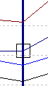
To define a new start point, drag Cursor 1 along the curve to the new start point. Repeat this procedure with Cursor 2 to define a new end point. You can also use the arrow keys to move the active cursor left or right. The active cursor is identified by a small box that appears where the cursor line meets the curve. Use the TAB key to switch the active cursor between Cursor 1 and Cursor 2.
As the cursor line moves from point to point along the curve, the information in the Calculations window is updated. You cannot drag Cursor 1 past Cursor 2 or vice versa.
De-indexing parameters and specifying Y-offsets
If you are plotting multiple parameters with different magnitudes, the lower magnitude values may be difficult to see in the default graph. Vista allows you to index any parameter to a different axis that can be scaled and offset independently from the other axes.
The new axis automatically assumes a scale appropriate for the selected parameter. In this way, you can plot parameters of different magnitudes on the same graph (such as voltage and current).
De-indexing a parameter or offsetting a parameter on the Y-axis
-
Right-click the graph background to display the menu. In the last section of the menu, highlight the curve you want to change.
The curve's sub-menu appears. (You can also access the sub-menu directly by right-clicking on the parameter curve or on its curve sample in the legend.)
- Select Options from the sub-menu to open the Curve Option dialog.
-
Choose one of the four axis options for the selected parameter. The axis is indicated by the location of the tick marks.
Specify a Y-offset if required. This shifts the selected parameter up the y-axis (or down for a negative number) by the amount you specify.
-
Click OK. A new axis appears with a default title and a scale appropriate for the selected parameter.
The scale of the default axis can also be adjusted to accommodate the remaining curves. A parameter has an asterisk after it in the legend if it has been offset.
Repeat these steps for each parameter that you want to de-index from the default axis. You can assign more than one parameter to an axis and the scale adjusts accordingly to incorporate each new parameter. For example, if you have plotted three voltage parameters and three current parameters, you can select the current curves and assign each of them to another common axis, leaving the three voltage curves to share the default axis.
Displaying Power Factor data
If you have plotted power factor data (from historical logs) in the Log View Plotter, you can improve the display to avoid discontinuity by setting the vertical axis to Power Factor Display (-100,+100).
Setting any vertical axis for Power Factor display
- Right-click the vertical axis or right-click the graph background and select the axis after you have plotted the power factor data.
- Select Power Factor Display from the menu. A check mark appears beside the option to indicate that it is selected.
You can plot other non-power factor data on the same graph; however, you should not plot the new data on the same axis as the power factor data. De-index the new data on a separate axis as described in De-indexing a parameter or offsetting a parameter on the Y-axis.
Viewing the Harmonics Analysis tab
If any of the parameters you have plotted is a waveform, you can display a histogram of the signal's harmonic content by selecting the Harmonics tab on the Log View Plotter window. The resulting histogram shows the harmonics for all waveforms in the plot.
NOTE: The cycle used is the first full cycle to the right of Cursor 1on the Plot Display tab.
The total harmonic distortion (THD), K-factor and Crest factor values for this waveform are displayed in the Calculations window.
To view the calculations for another parameter, click on it in the graph or on its curve sample in the legend. The Calculations window updates automatically. The currently selected parameter is indicated above the calculations.
Calculating Harmonics using more than one cycle
By default, the harmonics are calculated using one cycle. You can increase the number of cycles by any power of two cycles (i.e., 2, 4, 8, 16, 32 or 64) up to the maximum number of cycles available for the waveform.
- Right-click the background of the graph area then select Graph Options to open the Graph Options dialog.
- Select the number of cycles over which harmonics calculations are to be performed from the “# of cycles for harmonics” list.
- Select the appropriate frequency in the “System Frequency” box, if the waveform you are analyzing came from a system with a frequency other than 50Hz or 60Hz. (For example, if the waveform was captured from a 400 Hz system using a 3710 ACM, specify “400Hz” in this box.)
NOTE: The Harmonics Analysis tab is only available for waveform records. Vista does not perform a harmonics analysis for trend data or for waveforms with less than eight samples per cycle. You cannot display the harmonics of more than 16 parameters at a time.
Viewing the Phasor Diagram tab
If you have plotted waveforms for all three voltages and/or currents of your system, you can view this information as a phasor diagram. The phasor diagram graphically displays the three phases (voltages and/or currents), showing their relative magnitudes and angles.
You can use a phasor diagram to evaluate important aspects of your power system such as voltage balance, per-phase loading, and type of load (or generator operating mode). A phasor diagram also provides a way to identify PT or CT wiring problems.
NOTE: The timestamp at the top of the Phasor Diagram tab is based on the time of Cursor 1 on the Plot Display tab.
To display a phasor diagram, select the Phasor Diagram tab from the Log View Plotter window.
The Phasor Diagram and calculations are derived from a one-cycle window starting at Cursor 1 on the Plot Display tab. The magnitude and angle of the selected phase is displayed in the Calculations window.
NOTE: The Log View Plotter conforms to the convention where all phasors are plotted with respect to V1 (always at 0°) and rotate in a positive counter-clockwise direction. On a balanced power system, all three phases should appear 120 degrees apart.
To edit a phasor displayed on a phasor diagram, right-click a parameter in the legend to display a menu where you can change the phasor's color or delete the phasor from the diagram.
Symmetrical components
The Log View Plotter calculates the symmetrical components of your power system — the positive, negative, and zero sequences relative to the first phase — for the cycle selected. If you have plotted waveforms for three voltages and/or currents, you can access their symmetrical component calculations. To produce correct symmetrical components, the waveforms must have been plotted in the correct order (for example, V1, V2, V3 — not V1, V3, V2).
The analysis of an unbalanced system, such as determining the effects of a system fault, is made simpler by using symmetrical components. Symmetrical components are a mathematical tool that allows any system of three unbalanced phasors to be represented by three balanced phasor systems. The total current or voltage in any phase wire is expressed as the sum of three balanced, three-phase components.
Positive Sequence Components (1) - these consist of three phasors that are equal in magnitude and displaced from each other by 120º and have the same phase sequence as the original phasors.
Negative Sequence Components (2) - these consist of three phasors that are equal in magnitude and displaced from each other by 120º and have the phase sequence opposite to that of the original phasors.
Zero Sequence Components (0) - these consist of three phasors that are equal in magnitude and with zero phase displacement from each other.
If the original phasors of voltages are Va, Vb, and Vc, then the symmetrical components would be as follows:
- Va = Va1 + Va2 + Va0
- Vb = Vb1 + Vb2 + Vb0
- Vc = Vc1 + Vc2 + Vc0
The symmetrical components function, as implemented inside some
Viewing symmetrical components
- From a waveform Data Log Viewer (such as Waveforms/Sequence of Events), select all three phases of a fault (voltage or current).
- Select Edit > Plot Selected Data.
- Drag the Cursor and move it to the location of the fault.
- Click on the Phasor Diagram tab to view the Symmetrical Components in the Calculations window.
Plotting waveforms from devices with high sampling rates
Waveforms from devices with high sampling rates can be quite large. These large waveforms are split into a series of smaller waveforms when displayed in the data log. To plot all the sections of the waveform in Vista, you must select all the rows that relate to the waveform before you click the Plot button. All the rows related to the one waveform have the same timestamp.
When the waveform is displayed, you may need to zoom in to view the area of the waveform you are interested in. To zoom in, drag a selection box around the area you are interested in.
NOTE: To plot high speed transient waveforms, use the Web Applications waveform viewer in Diagrams or Alarms. High speed transient waveforms cannot be displayed correctly in Vista.
Adding parameters to a Log View Plotter
After you have created a graph and the Log View Plotter window is visible, you can add additional parameters to the graph by copying and pasting them into the graph. These parameters can be copied from the same data log viewer, a different data log viewer, or from a different Windows application such as Microsoft Excel. The x and y-axes are automatically re-scaled to accommodate the new parameters.
When adding waveforms to the log view plotter, you can correlate all of their trigger times. See Overlaying curves in the Log View Plotter for more information.
Adding data from a Data Log Viewer
You can add additional parameters from any data log viewer configured to provide compatible time-based data. Any added parameter is plotted using the same x-axis used by the existing curves. To avoid confusion ensure that the column you selected for your x-axis in the data log viewer (from which you are adding data) contains the same parameter (typically a timestamp) as the original data log viewer.
Adding additional parameters from a Data Log Viewer
- Select the range of cells you want to plot. Ensure that it contains the same type of information (timestamps) as the data already being plotted.
- Select Edit > Copy.
- Click on the title bar of the existing Log View Plotter window then select Edit > Paste. The parameters you selected are added to the graph.
If you want to plot waveforms on the same graph as historical data, the historical data should originate from high-speed data recorders and span a short time range, typically a few waveform cycles (<1 second).
Adding events from an Event Log Viewer
You can add events to a waveform or trend plot. This is useful for comparing abnormalities of the waveform or trend shape with any corresponding events that happened in the same time period.
- Select the row(s) you want to add in the Event Log Viewer.
- Select Edit > Copy.
- Click on the title bar of the existing Log View Plotter window then select Edit > Paste. The copied event records are added to the graph.
Each event is represented in the Log View Plotter as a diamond symbol. A diamond symbol is added to the legend and diamond symbols appear at the appropriate areas along the top of the diagram.
Point to a diamond symbol to display a description of the event in the status bar at the bottom of the screen.
Adding data from a spreadsheet or text file
You can select data from a spreadsheet or text file and paste it into an existing graph. This is useful if you want to compare trends from different times, waveforms showing different system events, and other analysis applications.
Ensure that the first column of data in the spreadsheet or text file is the same type as the first column in the data log viewer from which the log plot originated. In particular, for timestamps, make sure the entire timestamp is contained in a single column and that it uses the same date and time format as defined in the Windows Control Panel. If the date portion of the timestamp is in one column and the time is in another, or if the format is different in any way, the data cannot be pasted into the Log View Plotter.
When you paste data into a graph, from both spreadsheets and text files, the Log View Plotter interprets the first row of data in the selection as a heading. The first row in your selection is used to label the parameter in the legend. So, if the first row is not already used for column headings, insert a row and type in the label you want to appear in the Log View Plotter.
To copy data from a text file, the text file must be formatted correctly. Each column in the text file must be separated by a tab and there must be a hard return at the end of each row.
Adding data to a graph from a spreadsheet or text file
- Open the spreadsheet or text file.
- Copy the range of values you want to plot, including the first column and the first row. Include other columns in your selection, if required.
-
Click on the title bar of the Log View Plotter window then select Edit > Paste.
The parameters you copied and pasted are added to the graph. The axis scales are adjusted automatically to include the new data.
You can define a trigger for waveform records containing timestamps when you copy records from other applications. Simply add an exclamation mark to the end of the timestamp to indicate that it is the trigger time. For example, the exclamation mark at the end of 22/05/2015@02:00:41.035 PM! indicates that the trigger occurred at this time.
Customizing the Log View Plotter display
Many display attributes for each curve can be adjusted. In most cases, if you right-click an area of the graph, either a menu or a dialog opens with configuration options. Unless otherwise noted, the options you specify for the Log View Plotter window are saved and restored every time you plot data from the original data log viewer. If you plot data from a different data log viewer, its graph has its own optional settings.
Customizing an axis
After you have plotted data in the Log View Plotter, use the following instructions customize the axis or gridlines, change an axis label’s format or add an axis title, or change the font or color used on all axes. You can also change the scale of an axis.
Configuring an axis
- Right-click the graph background to display the menu. Highlight the axis from the menu to reveal the sub-menu. You can also right-click the axis to access the sub-menu directly.
-
Select Axis Properties from the sub-menu to open a dialog with the following options.
- Range: Make changes in the From and To boxes to adjust the axis range.
- Ticks: Make changes in the Major every and Sub-divided by boxes to adjust the frequency of major and minor ticks respectively.
- Grid: Select or clear the Major and Minor check boxes to turn graph gridlines on or off. Click the Style buttons to change to the line style or width of major and minor gridlines.
- Logarithmic scale: Select this check box to enable the logarithmic scale option.
- Line: Click this button to display the Line Parameters dialog and change the line style or the width of the axis.
- Click OK to save your changes.
NOTE: The axis range and the frequency of the major ticks are not stored in the diagram but are recalculated for every new plot.
Changing the color of an axis or the gridlines
- Right-click the graph background to display the menu. Highlight the axis from the menu to reveal the sub-menu. You can also right-click the axis to access the sub-menu directly.
- Select Axis Color, Major Grid Color, or Minor Grid Color from the sub-menu to open the Color dialog.
- Select the color you want or click Define Custom Colors for more options.
-
Click OK to save your changes.
The axis or the major or minor gridlines change to the color you selected.
Changing the format of the axis labels or adding an axis title
- Right-click the graph background to display the menu. Highlight the axis from the menu to reveal the sub-menu. You can also right-click the axis labels to access the sub-menu directly.
- Select Axis Labels from the sub-menu to open the Axis Labels dialog.
-
Select the format in which you want the axis labels to appear.
Decimal is used by default (for example, .01, .02, .03) but if the labels are too large or too small, select Scientific (1.0 x 10⁻², 2.0 x 10⁻², 3.0 x 10⁻²...) or Engineering (1m, 2m, 3m...).
-
Determine the axis title: select None to have no axis title or Text to enter your own title.
For time-based plots, the default x-axis title is “s” if the timestamps of the data spans a number of seconds, “mn” for minutes, “h” for hours, “d” for days, “m” for months. (This applies to the Plot Display tab only.)
For non time-based plots (CBEMA or harmonics), you can change the title. Select Text and type the title in the edit box. The title must be nine characters or less.
- Click OK to save your changes.
NOTE: If the first column of the source data includes a space or @ sign, the Log View Plotter assumes time on the horizontal axis and automatically determines the units based on timestamp information. The axis title is updated whenever the window is updated.
Changing the font used on all axes
- Right-click anywhere in the graph background and select Graph Font to open the Font dialog.
- Specify the font, style, size, effects and color options that you want to use for the axes labels.
- Click OK to save your changes.
Customizing curve style
When displaying multiple parameters, Vista distinguishes between parameters using color. Each parameter is listed in the graph legend accompanied by a sample of its associated curve. The color of a curve can be changed after you have plotted data in the Log View Plotter.
If color is not enough to distinguish one curve from another—for example, if you plan to print the graph on a black and white printer—you can change the curve style after you have plotted data in the Log View Plotter.
By default:
- Each curve is shown by a thin line that connects each point of data. You can customize the style of each curve independently and show or hide the coordinates of each data point.
- Harmonics are displayed in a bar graph. You can distinguish between parameters by customizing the display style of each parameter. Display options include bar type, hatching, width and color.
Use the following instructions to customize curve styles, bar styles, and curve colors.
Changing the style of a curve on the Plot Display tab
- Right-click the graph background to display the menu. Highlight the curve from the menu to reveal the sub-menu. You can also right-click the parameter curve in the diagram or its entry in the legend to access the sub-menu directly.
- Select Curve Properties from the sub-menu to open the Curve Style dialog.
- Select the type of curve you want from the Type list. Vista offers seven curve types: a simple line, a line with symbols, a scatter plot of markers, horizontal or vertical bars, or 3-D horizontal or vertical bars.
- Select Spline (available for Line or Line + Symbol types) if you want the line that connects each point to be a smooth curve. If you leave it cleared, each pair of points is connected by a straight line.
- Select Fill Area (available for Line type) to fill the area under the curve with the line color. Clear the check box to leave the area under the curve transparent.
- The Marker section is available for Line + Symbol and Scattered types of lines. Specify the shape, size, and style of the marker used for the points. The Style options apply only to geometric shapes (for example, circles, boxes, diamonds, etc.).
- For any line type, click Line to change the width and the style (for example, solid, dotted, dashed, etc.) of the line. For bar graph types, a dialog opens where you can specify the hatching pattern and the width of the bars.
- Click OK to save your changes.
Changing the bar style for the Harmonics Analysis tab
- Right-click the bar (or on its curve sample in the legend) and select Curve Properties to open the Bar Graph Configuration dialog.
- Select the type of bar to use from the Type list. This selection is applied to all bars in the graph. Three bar styles are available:
- Group Bars: Shows bars side-by-side
- Deep Bars: Shows bars one behind the other
- Stacked Bars: Shows bars stacked one on top of the other vertically
- Select a hatching style for the selected bar from the Hatching list. This selection is applied to the currently selected bar only.
- Set how wide you want each bar to be in the Width text box. The specified width is applied to all bars in the graph. The default depends upon the number of parameters.
- Click OK to save your changes.
Changing the color of a curve
- Right-click the graph background to display the menu. Highlight the curve from the menu to reveal the sub-menu. You can also right-click the curve in the diagram or its entry in the legend to access the sub-menu directly.
- Select Curve Color from the sub-menu to open the Color dialog.
- Select the color you want or click Define Custom Colors for more options.
- Click OK. The curve changes to the color you selected.
Customizing graph and legend options
After you have plotted data in the Log View Plotter, you can change the color of the graphing area (and the legend) and define a font for the legend.
Changing the color of the graphing area
- Right-click anywhere in the graph background and select Background Color to open the Color dialog.
- Select the color you want or click Define Custom Colors for more options.
- Click OK. The graphing area changes to the specified color.
Changing the font used in the legend
- Right-click the background of the legend to open the Font dialog.
- Specify the font, style, size, effects, and color options that you want to use for the legend text.
- Click OK to save your changes.
Removing graph parameters
After you have plotted data in the Log View Plotter, you can remove a parameter from the graph.
- Right-click the graph background to display the menu. Highlight the curve you want to remove from the menu to reveal the sub-menu. You can also right-click the curve in the diagram or its entry in the legend to access the sub-menu directly by right-clicking on the curve.
- Select Delete Curve from the sub-menu. The curve is deleted without further prompting.
Overlaying curves in the Log View Plotter
After you plot data in the Log View Plotter, you can overlay a curve onto your graph to help analyze sag/swell data. This applies to devices that measure disturbances in voltage and store the magnitude and duration of these disturbances. When these values are inserted into the ION_Data database, they provide a series of coordinates that can be plotted on a voltage tolerance curve. A voltage tolerance curve is often used to categorize the severity of a voltage disturbance.
NOTE: Most Vista queries are plotted against timestamps (with the timestamp as the x-axis); however, any query that uses the ION Sag/Swell module must be plotted against duration. When plotting sag/swell data, select Duration as the X-parameter of the Log View Plotter.
Vista provides common curves or voltage tolerance envelopes that can be used as overlays in the Log View Plotter:
-
CBEMA/ITIC: These curves (for CBEMA, described by the IEEE standard 446-1987, and for ITIC, described by the IEEE 1100-1999 standard) define an upper and a lower bound on the types of disturbances that electrical equipment is likely to tolerate. It plots disturbance magnitude against disturbance duration and indicates at what points a voltage disturbance is likely to disrupt or damage equipment. Points near or outside the voltage tolerance envelope indicate events that could interrupt or damage electrical equipment.
- SEMI F47-0200: This specification defines the voltage sag tolerance capability required for semiconductor processing equipment, though it is now used by other industries. According to the specification, equipment must tolerate sags to 50% of nominal voltage for up to 200 milliseconds, sags to 70% of nominal voltage for up to 0.5 seconds, and sags to 80% of nominal voltage for up to 1 second. Points above the voltage tolerance curve indicate disturbances that exceed these specifications.
Overlaying curves on plotted data
To overlay one of the provided curves, you need a data log viewer that contains the magnitude and duration values for the sag/swell disturbances. The Duration column must be set as the X-parameter for the Log View Plotter—it appears in blue in the data log viewer table (See X-parameter for Log View Plotter for more information on setting the X-parameter for Data Log Viewers). The Magnitude values can be in any one of the other columns.
- In the Data Log Viewer, select a range of cells to be plotted.
- Select Edit > Plot Selected Data. The Log View Plotter window appears with Duration as the x-axis and Magnitude as the y-axis.
- Right-click the graph and select Overlay Curve from the menu to open the Overlay Curve dialog.
- Select the text file containing the curve data that you want to overlay (from the ...\
-
Click Open. The selected curve appears in the graph.
You can review each point in your data and see where it falls in relation to the curve.
NOTE: This process automatically changes your x-axis scale to logarithmic.