Visualization Element 'Combo box integer'

Tag: Common controls
The element shows values as a drop-down list. When the user clicks an entry, the ID of the entry is written to an integer variable. The entries in the drop-down list can be from a list and contain images from an image pool.
|
Element name |
Example: List of product numbers Optional Hint: Assign individual names for elements so that they are found faster in the element list. |
|
Type of element |
Combo box integer |
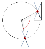
The position defines the location and size of the element in the visualization window. These are based on the Cartesian coordinate system. The origin is located at the upper left corner of the window. The positive horizontal x-axis runs to the right. The positive vertical y-axis runs downwards.
|
X |
X coordinate of the upper left corner of the element Specified in pixels. Example: 10. |
|
Y |
Y coordinate of the upper left corner of the element Specified in pixels. Example: 10. |
|
Width |
Specified in pixels. Example: 150 |
|
Height |
Specified in pixels. Example: 30 |
Note
You can also change the values by dragging the box symbols ( ) to other positions in the editor.
See also
The properties contain fixed values for the coordinates of the point of rotation. This point of rotation is shown as the  symbol. The point is used as the center for rotating and scaling.
|
X |
X-coordinate of the point of rotation |
|
Y |
Y-coordinate of the point of rotation |
Note
You can also change the values by dragging the symbols () to other positions in the editor.
|
Variable |
At runtime, saves the text list ID of the list entry that the user clicks If only one image pool is displayed, then the image ID is saved.
|
|
Text list |
Displayed as combo box. Every text list entry becomes a combo box entry.
|
|
Image pool |
Displayed as combo box. Every image in the image pool becomes a combo box entry. Example: 'ImagePool_A' |
See also
Element property 'Settings of the list'
Displayed list that expands when a visualization user clicks into the element.
|
Number of rows setting |
|
|
Number of visible rows |
Number of visible lines of the combo box drop-down list defined here
Note: The property is available when the Number of rows setting property is set to Explicit. |
|
Row height |
|
|
Height of image |
Image height (in pixels) of the image displayed in the drop-down list entry
Note: Images are displayed only when a value is specified in the Image pool property. |
|
Width of image |
Image width (in pixels) of the image displayed in the drop-down list entry
Note: Images are displayed only when a value is specified in the Image pool property. |
|
Offset of image |
Makes the images in the selection list appear offset (in pixels) from the left margin. An offset of 0 means that the images are displayed directly on the margin.
Note: Images are displayed only when a value is specified in the Image pool property. |
|
Scrollbar size |
Size of the scrollbar (in pixels). The scrollbar is displayed when more entries are specified in the drop-down list than in Number of visible rows. Default: 20 |
|
Tooltip |
Character string (without single straight quotation marks) that is displayed as the tooltip of an element in runtime mode Example: Products of customer A Hint: The text is accepted automatically into the GlobalTextList text list and can be localized there. |
See also
Element property 'Value range'
|
Limit valuerange |
Limits the text list to one subrange. This subrange is displayed by the combo box. Requirement: A value is specified in the Text list property.
|
|
Minimum value |
ID of the text list entry from which a combo box entry is displayed
|
|
Maximum value |
ID of the text list entry up to which combo box entries are displayed
|
|
Filter missing textentries |
Requirement: A value is specified in the Text list property. |
Element property 'Text properties'
The properties contain fixed values for the text properties.
|
Usage of |
|
|
Individual text properties Requirement: The Individual settings text property is defined. |
|
|
Horizontal alignment |
Horizontal alignment of the text within the element. |
|
Vertical alignment |
Vertical alignment of the text within the element. |
|
Font |
Example: Default
|
|
Font color |
Example: Black
|
|
Transparency |
Whole number (value range from 0 to 255). This determines the transparency of the respective color. Example: 255: The color is opaque. 0: The color is completely transparent. Please note: If the color is a style color and already has a transparency value, then this property is write-protected. |
Element property 'Absolute movement'
The properties contain IEC variables for controlling the position of the element dynamically. The reference point is the upper left corner of the element. In runtime mode, the entire element is moved.
|
Movement |
||
|
X |
Variable (numeric data type). Defines the X position (in pixels). Example: PLC_PRG.iPos_X. Increasing this value in runtime mode moves the element to the right. |
|
|
Y |
Variable (numeric data type). Defines the Y position (in pixels). Example: PLC_PRG.iPos_Y. Increasing this value in runtime mode moves the element downwards. |
|
|
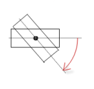
Rotation |
Variable (numeric data type). Defines the angle of rotation (in degrees). Example: PLC_PRG.iAngle1.
The midpoint of the element rotates at the Center point. This rotation point is shown as the In runtime mode, the alignment of the element remains the same with respect to the coordinate system of the visualization. Increasing the value rotates the element to the right. |
|
|
Interior rotation |
Variable (numeric data type). Defines the angle of rotation (in degrees). Example: PLC_PRG.iAngle2. In runtime mode, the element rotates about the point of rotation specified in Center according to the value of the variable. In addition, the alignment of the element rotates according to the coordinate system of the visualization. Increasing the value in the code rotates clockwise.
The rotation point is shown as the Note: If a static angle of rotation is specified in the Position ‣ Angle property, then the static angle of rotation is added to the variable angle of rotation (offset) when the visualization is executed. |
|
Note
You can link the variables to a unit conversion.
Note
The X, Y, Rotation, and Interior rotation properties are supported by the "Client Animation" functionality.
See also
Element property 'State variables'
The variables control the element behavior dynamically.
|
Invisible |
Variable (BOOL). Toggles the visibility of the element. TRUE: The element is not visible at runtime. |
|
Deactivate inputs |
Variable (BOOL). Toggles the operability of the element. TRUE: User inputs do not have any effect in runtime more. The element is shown as deactivated. |
Note
The Invisible property is supported by the "Client Animation" functionality.
See also
These properties are available only when you select the Preview: Support client animations and overlay of native elements option in the Visualization Manager.
You can animate a movement, a rotation, and the visibility of a visualization element.
|
Animation time |
Time that the element executes an animation (in milliseconds) Example: 500 |
|
Move to the foreground |
Property value (BOOL) TRUE: At runtime, the element is displayed in the foreground. FALSE: At runtime, the element is displayed in the layer where it was inserted in the visualization editor. |
See also
Element property 'Access rights'
Requirement: User management is set up for the visualization.
|
Access rights |
Opens the Access rights dialog. There you can edit the access privileges for the element. Status messages:
|
See also
 : Only the subrange that is defined by the
  : The
: The  : Drop-down list with style fonts.