Tag: Basic
The element serves as a frame in which to display one or more already existing visualizations. You get a structured user interface. The size of the frame can be fixed or scaled. The display area of the referenced visualization then adapts itself to the frame size.
|
Element name |
Example: refVisUserInfo |
|
Type of element |
Frame |
|
Clipping |
Requirement: Scaling type property is Fixed. |
|
Show frame |
Shows the frame
|
|
Scaling type |
The method with which the height and width of the referenced visualization are scaled.
|
Element properties 'Scrollbar settings'
The properties contain variables for the position of the scrollboxes in the scrollbars. You can then edit the data of the scrollbox position in the application.
|
Requirement: the property Scaling type is fixed and scrollable. |
|
|
Scroll position variable horizontal |
Variable (integer data type, also as array). Contains the position of the horizontal or vertical scrollbox. The array contains the position for every display variant. If the visualization runs on several display variants, then the position changes are decoupled from each other. Example: PLC_PRG.iScrollHor[CURRENTCLIENTID] PLC_PRG.iScrollVer[CURRENTCLIENTID] The variable is declared as an array in the example. iScrollHor: ARRAY[0..20] OF INT; iScrollVer: ARRAY[0..20] OF INT; CURRENTCLIENTID indexes the current display variant. |
|
Scroll position variable vertical |
|
Note
You can combine the variables with a unit conversion.
See also
|
Deactivation of the background character |
Consequence: Elements can be displayed in an unexpected order at runtime. For example, an animated element can push itself behind the frame at runtime.
|
Contains the currently configured visualization references as a subnode
|
References |
Clicking Configure opens the Frame Configuration dialog. This is used to manage the referenced visualizations. |
|
List of the currently referenced visualizations |
Visualizations that have a button also have this displayed as a subnode. Each interface variable is listed with the currently assigned transfer parameters. Example: vis_FormA
Hint: You can change the assignment of the variables to an interface variable here and edit the value field. Or click the Configure button instead. |
See also
The position defines the location and size of the element in the visualization window. These are based on the Cartesian coordinate system. The origin is located at the upper left corner of the window. The positive horizontal x-axis runs to the right. The positive vertical y-axis runs downwards.
|
X |
X coordinate of the upper left corner of the element Specified in pixels. Example: 10. |
|
Y |
Y coordinate of the upper left corner of the element Specified in pixels. Example: 10. |
|
Width |
Specified in pixels. Example: 150 |
|
Height |
Specified in pixels. Example: 30 |
Note
You can also change the values by dragging the box symbols ( ) to other positions in the editor.
See also
The properties contain fixed values for the coordinates of the point of rotation. This point of rotation is shown as the  symbol. The point is used as the center for rotating and scaling.
|
X |
X-coordinate of the point of rotation |
|
Y |
Y-coordinate of the point of rotation |
Note
You can also change the values by dragging the symbols () to other positions in the editor.
The properties contain fixed values for the colors.
|
Color |
Color of the frame
Please note: the normal state is when the Boolean variable in the property Color variables ‣ Toggle color is not defined or its value is FALSE. |
|
Alarm color |
Color with which the element is filled during the alarm state. Please note: Alarm state is when the value of the Boolean variable in the property Color variables ‣ Toggle color is FALSE. |
|
Transparency |
Integer number (value range from 255 to 0). Specifies the transparency of the associated color. 255: The color is opaque. 0: The color is fully transparent. Please note: If the color is a style color and already contains a transparency value, then this property is write-protected. |
See also
The properties contain fixed values for setting the look of the element.
|
Line width |
Value in pixels Example: 2 Note: The values 0 and 1 both result in a line weight of one pixel. If no line should be displayed, then the Line style property must be set to the option Invisible. |
|
Line style |
Type of line representation
|
Note
You can assign variables in the Appearance variables property for controlling the appearance dynamically. The fixed values are defined here.
See also
The properties contains character strings for labeling the element. The character string can also contain a placeholder with a format definition. In runtime mode, the placeholder is replaced by the current value in the specified format.
CODESYS accepts the specified texts automatically into the GlobalTextList text list. Therefore, these texts can be localized.
|
Text |
Character string (without single straight quotation marks) for the labeling the element. Add a line break by pressing the keyboard shortcut Ctrl + Enter. Example: Accesses: %i The variable that contains the current value for the placeholder is specified in the property Text variable ‣ Text . |
|
Tooltip |
Character string (without single straight quotation marks) that is displayed as the tooltip of an element. Example: Number of valid accesses. The variable that contains the current value for the placeholder is specified in the property Text variable ‣ Tooltip . |
See also
Element property 'Text properties'
The properties contain fixed values for the text properties.
|
Horizontal alignment |
Horizontal alignment of the text within the element. |
|
Vertical alignment |
Vertical alignment of the text within the element. |
|
Text format |
Definition for displaying texts that are too long
|
|
Font |
Example: Default
|
|
Font color |
Example: Black
|
|
Transparency |
Whole number (value range from 0 to 255). This determines the transparency of the respective color. Example: 255: The color is opaque. 0: The color is completely transparent. Please note: If the color is a style color and already has a transparency value, then this property is write-protected. |
Element property 'Absolute movement'
The properties contain IEC variables for controlling the position of the element dynamically. The reference point is the upper left corner of the element. In runtime mode, the entire element is moved.
|
Movement |
||
|
X |
Variable (numeric data type). Defines the X position (in pixels). Example: PLC_PRG.iPos_X. Increasing this value in runtime mode moves the element to the right. |
|
|
Y |
Variable (numeric data type). Defines the Y position (in pixels). Example: PLC_PRG.iPos_Y. Increasing this value in runtime mode moves the element downwards. |
|
|
Rotation |
Variable (numeric data type). Defines the angle of rotation (in degrees). Example: PLC_PRG.iAngle1.
The midpoint of the element rotates at the Center point. This rotation point is shown as the In runtime mode, the alignment of the element remains the same with respect to the coordinate system of the visualization. Increasing the value rotates the element to the right. |
|
|
Scaling |
Variable (integer data type). Causes centric stretching. Example: PLC_PRG.iScaling. The reference point is the Center property. The value 1 shrinks the element by a factor of 0.001. The value 1000 returns the element to its original size. |
|
|
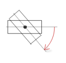
Interior rotation |
Variable (numeric data type). Defines the angle of rotation (in degrees). Example: PLC_PRG.iAngle2. In runtime mode, the element rotates about the point of rotation specified in Center according to the value of the variable. In addition, the alignment of the element rotates according to the coordinate system of the visualization. Increasing the value in the code rotates clockwise.
The rotation point is shown as the Note: If a static angle of rotation is specified in the property Position ‣ Angle , then the static angle of rotation is added to the variable angle of rotation (offset) when the visualization is executed. |
|
Note
You can link the variables to a unit conversion.
Note
The properties X, Y, Rotation, and Interior rotation are supported by the "Client Animation" functionality.
See also
Element property 'Relative movement'
The properties contains variables for moving the element. The reference point is the position of the element (Position property). The shape of the element can change.
|
Movement top-left |
|
|
X |
Variable (integer data type). It contains the number (in pixels) that the left edge is moved horizontally. Incrementing the value moves the element to the right. Example: PLC_PRG.iDeltaX |
|
Y |
Variable (integer data type). It contains the number (in pixels) that the top edge is moved vertically. Incrementing the value moves the element to the down. Example: PLC_PRG.iDeltaY |
|
Movement bottom-right |
|
|
X |
Variable (integer data type). It contains the number (in pixels) that the right edge is moved horizontally. Incrementing the value moves the element to the right. Example: PLC_PRG.iDeltaWidth |
|
Y |
Variable (integer data type). It contains the number (in pixels) that the bottom edge is moved vertically. Incrementing the value moves the element to the down. Example: PLC_PRG.iDeltaHeight |
See also
Element property 'Text variables'
These properties are variables with contents that replace a format definition.
|
Text variable |
Variable (data type compliant with the format definition). It contains what is printed instead of the format definition. Example: PLC_PRG.iAccesses Note: The format definition is part of the text in the property Texts ‣ Text . Note: If you specify a variable of type enumeration with text list support, then the name of the enumeration data type is added automatically in angle brackets after the variable name. Example: PLC_PRG.enVar <enumeration name>. Then the symbolic value of the enumeration component is printed instead of the numeric value when text is printed. Refer to the help page for the enumerations. |
|
Tooltip variable |
Variable (data type compliant with the format definition). It contains what is printed instead of the format definition. Example: PLC_PRG.iAccessesInTooltip Note: The format definition is part of the text in the property Texts ‣ Tooltip . |
See also
Element property 'Dynamic texts'
Dynamic texts are variably indexed texts of a text list. At runtime, the text is displayed that is currently indexed in the variable.
|
Text list |
Variable (string) or name of the text list as a fixed string in single straight quotation marks. Example: 'Errorlist'
|
|
Text index |
Text list ID. This refers to the desired output text.
|
|
Tooltip index |
Text list ID. This refers to the desired output text.
|
See also
Element property 'Font variables'
The variables allow for dynamic control of the text display.
|
Font name |
Variable (STRING). Includes the font of the text. Example: PLC_PRG.stFontVar := 'Arial'; The selection of fonts corresponds to the default Font dialog. |
|
Size |
Variable (numeric data type). Contains the font size (in pixels or points). The applied unit is specified in brackets after the variable name.
Hint: The font size is specified in points (example: Arial 12). Use points when the variable font size should match a font, for example if a font is set in the property Text property ‣ Font . |
|
Flags |
Variable (DWORD). Contains the flags for displaying fonts. Flags:
Note: You can combine the font displays by adding the coding of the flags. For example, a bold and underlined text: PLC_PRG.dwFontType := 6; |
|
Character set |
Variable (DWORD). Contains a character set number for the font. The selection of character set numbers corresponds to the Script setting of the standard Font dialog. |
|
Color |
Variable (DWORD). Includes the color of the text. Example: PLC_PRG.dwColorFont:= 16#FF000000; |
|
Flags for text alignment |
Variable (integer data type). Contains the coding for text alignment. Example: PLC_PRG.dwTextAlignment. Coding:
Note: You can combine the text alignments by adding the coding of the flags. For example, a vertical and horizontal centered text: PLC_PRG.dwFontType := 5; |
Note
Fixed values for displaying texts are set in Text properties.
See also
Element property 'Colorvariables'
The Element property is used as an interface for project variables to dynamically control colors at runtime.
|
Toggle color |
The property controls the toggled color at runtime. Value assignment:
Assigning the property:
|
|
Color |
Color variable for the frame
Requirement: Show frame property is activated. Please note that the normal state is in effect if the expression in the Colorvariables ‣ Toggle color property is not defined or it has the value FALSE. |
|
Alarm color |
Color variable for the frame in alarm state
Please note that the alarm state is in effect if the expression in the Colorvariables ‣ Toggle color property has the value TRUE. |
Note
The transparency part of the color value is evaluated only if the Activate semi-transparent drawing option of the visualization manager is selected.
Note
Select the Advanced option in the toolbar of the properties view. Then all element properties are visible.
See also
Element property 'Appearance variables'
The properties contain variables for controlling the appearance of the element dynamically.
|
Line width |
Variable (integer data type). Contains the line weight (in pixels). Note: The values 0 and 1 both result in a line weight of one pixel. If no line should be displayed, then the Line style property must be set to the option Invisible. |
|
Line style |
Variable (DWORD). Controls the line style. Coding:
|
Note
Fixed values can be set in the Appearance property. These values can be overwritten by dynamic variables at runtime.
See also
Element property 'State variables'
The variables control the element behavior dynamically.
|
Invisible |
Variable (BOOL). Toggles the visibility of the element. TRUE: The element is not visible at runtime. |
|
Deactivate inputs |
Variable (BOOL). Toggles the operability of the element. TRUE: User inputs do not have any effect in runtime more. The element is shown as deactivated. |
Note
The Invisible property is supported by the "Client Animation" functionality.
See also
These properties are available only when you select the Preview: Support client animations and overlay of native elements option in the Visualization Manager.
You can animate a movement, a rotation, and the visibility of a visualization element.
|
Animation time |
Time that the element executes an animation (in milliseconds) Example: 500 |
|
Move to the foreground |
Property value (BOOL) TRUE: At runtime, the element is displayed in the foreground. FALSE: At runtime, the element is displayed in the layer where it was inserted in the visualization editor. |
See also
Element property 'Switch frame variable'
The variable controls the switch of the visualization to another display variant as soon as another value is assigned to it for the index. The value can be assigned manually or programmatically.
|
Variable |
Variable (integer data type). Contains the index of the active visualization. Example: PLC_PRG.uiActiveVisuID. Tip: The Frame Configuration dialog includes a list of selected visualizations. The visualizations are ordered automatically in numeric order in the list. Note: This variant of switching usually affects all connected display variants. |
See also
Element property 'Input configuration'
The properties contain the configurations for the user input when using the mouse or keyboard. A user input defines an event and one or more actions that are executed when an event occurs.
|
The Configure button opens the Input configuration dialog box for creating or modifying a user input. Configured user inputs are briefly listed below the events. They each include the action that is triggered and the setting in short form.
Example: Execute ST code: |
|
|
OnDialogClosed |
Input event: The user closes the dialog box. |
|
OnMouseClick |
Input event: The user clicks the mouse button completely. The mouse button is clicked and released. |
|
OnMouseDown |
Input event: The user clicks down on the mouse button. |
|
OnMouseEnter |
Input event: The user drags the mouse pointer to the element. |
|
OnMouseLeave |
Input event: The user drags the mouse pointer away from the element. |
|
OnMouseMove |
Input event: The user moves the mouse pointer over the element area. |
|
OnMouseUp |
Input event: The user releases the mouse button over the element area. |
|
Tap |
When a mouse click event occurs, the variable defined in Variable is described in the application. The coding depends on the options Tap FALSE and Tap on enter if captured. |
|
Variable |
Variable (BOOL) that is set on mouse click. Example: PLC_PRG.bIsTapped TRUE: A mouse click event exists. It lasts while the user presses the mouse button over the element. It ends when the button is released. FALSE: A mouse click event does not exist. Requirement: The Tap FALSE option is not activated. |
|
Tap FALSE |
TRUE: A mouse click event does not exist. FALSE: While the mouse click event exists. |
|
Tap on enter if captured |
TRUE: While the mouse click event exists and the mouse pointer is moved over the element area. FALSE: A mouse click event does not exist. Or the user moves the mouse pointer outside of the element area while the mouse button is pressed. The value is TRUE again as soon as the user moves the pointer back to the element area. The mouse is then captured. |
|
Shift |
With the onset of a mouse click event, the variable is set; when the mouse click event is completed, the variable is reset. |
|
Variable |
Variable (BOOL). Its value toggled when the mouse click event is ended. This is when the user releases the mouse button while the mouse pointer is over the element area. If the user releases the mouse button while the mouse pointer is outside of the element area, then the mouse click event is not ended and the value is not toggled. Tip: The user can cancel a started toggle input by dragging the mouse pointer out of the element area. |
|
Toggle on up if captured |
|
|
Keyboard shortcuts |
Keyboard shortcut on the element for triggering specific input actions. When the keyboard shortcut event occurs, the input actions in the Event(s) property are triggered. In this way, it is not the input action itself that leads to this input action, but the mouse input action. |
|
Key |
Key pressed for input action. Example: T Note: The following properties appear when a key is selected. |
|
Event(s) |
|
|
Shift |
Example: Shift+T. |
|
Control |
Example: Ctrl+T. |
|
Alt |
Example: Alt+T. |
Note
All keyboard shortcuts and their actions that are configured in the visualization are listed in the Keyboard configuration tab.
See also
 : Fixed size. Only that part of the referenced visualization that fits inside the frame is displayed.
 : The background is drawn. The non-animated element of the referenced visualization is drawn as a background bitmap in order to optimize the performance of the visualization.
 : Selection list with style colors appears
 : Standard dialog
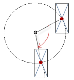
 If you click in the value field, a drop-down list opens on the right for setting the unit.
 to insert the placeholder