Visualization Element 'Potentiometer'

Tag: Measurement controls
The element displays the value of a variable as a setting on the potentiometer. A visualization user can modify the value by dragging the pointer to another position.
See also
|
Element name |
Example: GenElemInst_1 |
|
Type of element |
Potentiometer |
|
Variable |
Variable (numeric data type). Contains the position of the pointer for the potentiometer. A visualization user can modify the value by dragging the pointer to another position. |
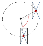
The properties contain fixed values for the coordinates of the point of rotation. This point of rotation is shown as the  symbol. The point is used as the center for rotating and scaling.
|
X |
X-coordinate of the point of rotation |
|
Y |
Y-coordinate of the point of rotation |
Note
You can also change the values by dragging the symbols () to other positions in the editor.
These properties are available only when you select the Preview: Support client animations and overlay of native elements option in the Visualization Manager.
You can animate a movement, a rotation, and the visibility of a visualization element.
|
Animation time |
Time that the element executes an animation (in milliseconds) Example: 500 |
|
Move to the foreground |
Property value (BOOL) TRUE: At runtime, the element is displayed in the foreground. FALSE: At runtime, the element is displayed in the layer where it was inserted in the visualization editor. |
See also
The position defines the location and size of the element in the visualization window. These are based on the Cartesian coordinate system. The origin is located at the upper left corner of the window. The positive horizontal x-axis runs to the right. The positive vertical y-axis runs downwards.
|
X |
X coordinate of the upper left corner of the element Specified in pixels. Example: 10. |
|
Y |
Y coordinate of the upper left corner of the element Specified in pixels. Example: 10. |
|
Width |
Specified in pixels. Example: 150 |
|
Height |
Specified in pixels. Example: 30 |
Note
You can also change the values by dragging the box symbols ( ) to other positions in the editor.
See also
|
Background color |
Drop-down list with background colors |
|
Own image |
|
|
Optimized drawing |
Note: Deactivating this option is sensible only in certain exceptional cases. |
|
Hand style |
Drop-down list with different arrow types |
|
Color |
|
|
Arrow start |
Angle (in degrees) between the left edge of the element and the horizontal axis |
|
Arrow end |
Angle (in degrees) between the right edge of the element and the horizontal axis |
|
Subscale position |
|
|
Scale type |
Type of scale
|
|
Scale start |
Least value of the scale and the lower limit of the value range for the element. Example: 0
|
|
Variable |
Variable (integer data type). Contains the scale start. Example: PLC_PRG.iScaleStart Declaration: PROGRAM PLC_PRG VAR iScaleStart : INT := 0; END_VAR |
|
Scale end |
Greatest value of the scale and the upper limit of the value range for the element. Example: 100
|
|
Variable |
Variable (integer data type). Contains the scale end. Example: PLC_PRG.iScaleEnd Declaration: PROGRAM PLC_PRG VAR iScaleEnd : INT := 120; END_VAR |
|
Main scale |
Distance between two values on the rough scale. Example: 10
|
|
Variable |
Variable (integer data type). Contains the distance. Example: PLC_PRG.iMainScale Declaration: PROGRAM PLC_PRG VAR iMainScale : INT := 20; END_VAR |
|
Subscale |
Distance between two values on the fine scale. You can hide the fine scale by setting the value to 0. Example: 2
|
|
Variable |
Variable (integer data type). Contains the spacing. Example: PLC_PRG.iSubScale Declaration: PROGRAM PLC_PRG VAR iSubScale : INT := 5; END_VAR |
|
Scale line width |
Specified in pixels. Example: 3 |
|
Scale color |
Color of scale lines
|
|
Scale in 3D |
Note: This property is not displayed in FlatStyle. |
|
Show scale |
|
|
Frame inside |
|
|
Frame outside |
|
|
Label |
Selection list
|
|
Unit |
Text that is displayed in the element. Example: Units displayed in m/s. |
|
Font |
Font for labels (example: scale numbering).
Selection from the drop-down list or by clicking the button. |
|
Scale format (C Syntax) |
Values scaled in "printf" syntax Examples: %d, %5.2f |
|
Max. text width of labels |
(optional) Value that redefines the maximum width of the scale label. The correct value is normally set automatically. Note: Change this value only if the automatic adjustment does not yield the expected result. |
|
Text height of labels |
(optional) Value that redefines the maximum height of the scale label. The correct value is normally set automatically. Note: Change this value only if the automatic adjustment does not yield the expected result. |
|
Font color |
Selection from the drop-down list or by clicking the |
Element property 'Positioning'
|
Usage of |
|
|
Positioning Requirement: User-defined settings is selected as Usage of. The displayed positioning settings depend on the type of needle instrument and potentiometer, and partially on whether a custom background image is selected. The following settings are used for achieving the exact position relative to the background image. |
|
|
Needle movement |
Length of the needle (in pixels) |
|
Scale movement |
Distance from the tick marks to the center (in pixels) Requirement: A customer image is selected as Background. |
|
Scale length |
Length of the tick marks (in pixels) Requirement: A customer image is selected as Background. |
|
Label offset: |
Distance from the labels to the tick marks (in pixels) |
|
Unit offset: |
Distance of the unit text Label ‣ Unit from the upper scale edge (in pixels) |
|
Origin offset |
Offset of the element (in pixels) Requirement: For the elements Meter 180° and Meter 90°, this property is displayed only if a custom image is selected as Background. |
|
Color areas |
|
|
Durable color areas |
|
|
Use colors for scale |
|
|
Color areas |
|
|
Create new |
A new color area is added to the Elements view. |
|
Delete |
The color area is removed from the list and the list is refreshed. |
|
Begin of area |
Start value of the color area Example: 20
|
|
Variable |
Variable (integer data type). Contains the start value. Example: PLC_PRG.iColorAreaStart0 Declaration: PROGRAM PLC_PRG VAR iColorAreaStart0 : INT := 80; END_VAR |
|
End of area |
End value of the color area Example: 120
|
|
Variable |
Variable (integer data type). Contains the end value. Example: iColorAreaEnd0 Declaration: PROGRAM PLC_PRG VAR iColorAreaEnd0 : INT := 100; END_VAR |
|
Color |
Color that is used for displaying the area. |
Element property 'State variables'
The variables control the element behavior dynamically.
|
Invisible |
Variable (BOOL). Toggles the visibility of the element. TRUE: The element is not visible at runtime. |
|
Deactivate inputs |
Variable (BOOL). Toggles the operability of the element. TRUE: User inputs do not have any effect in runtime more. The element is shown as deactivated. |
Note
The Invisible property is supported by the "Client Animation" functionality.
See also
Element property 'Absolute movement'
The properties contain IEC variables for controlling the position of the element dynamically. The reference point is the upper left corner of the element. In runtime mode, the entire element is moved.
|
Movement |
||
|
X |
Variable (numeric data type). Defines the X position (in pixels). Example: PLC_PRG.iPos_X. Increasing this value in runtime mode moves the element to the right. |
|
|
Y |
Variable (numeric data type). Defines the Y position (in pixels). Example: PLC_PRG.iPos_Y. Increasing this value in runtime mode moves the element downwards. |
|
|
Rotation |
Variable (numeric data type). Defines the angle of rotation (in degrees). Example: PLC_PRG.iAngle1.
The midpoint of the element rotates at the Center point. This rotation point is shown as the In runtime mode, the alignment of the element remains the same with respect to the coordinate system of the visualization. Increasing the value rotates the element to the right. |
|
|
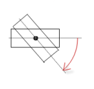
Interior rotation |
Variable (numeric data type). Defines the angle of rotation (in degrees). Example: PLC_PRG.iAngle2. In runtime mode, the element rotates about the point of rotation specified in Center according to the value of the variable. In addition, the alignment of the element rotates according to the coordinate system of the visualization. Increasing the value in the code rotates clockwise.
The rotation point is shown as the Note: If a static angle of rotation is specified in the Position ‣ Angle property, then the static angle of rotation is added to the variable angle of rotation (offset) when the visualization is executed. |
|
Note
You can link the variables to a unit conversion.
Note
The X, Y, Rotation, and Interior rotation properties are supported by the "Client Animation" functionality.
See also
Element property 'Access rights'
Requirement: User management is set up for the visualization.
|
Access rights |
Opens the Access rights dialog. There you can edit the access privileges for the element. Status messages:
|
See also
 symbol.
 : The background image is drawn one time. If there is a change in the foreground, then only the affected part of the image is redrawn.
 : The background image is redrawn in cycles.
 : The
: The  : Drop-down list with color names
 : The property