Visualization Element 'Radio button'

Tag: Common controls
The element provides a field with any number of options.
|
Element name |
Optional Hint: Assign individual names for elements so that they are found faster in the element list. Example: early_shift |
|
Type of element |
Radio button |
The position defines the location and size of the element in the visualization window. These are based on the Cartesian coordinate system. The origin is located at the upper left corner of the window. The positive horizontal x-axis runs to the right. The positive vertical y-axis runs downwards.
|
X |
X coordinate of the upper left corner of the element Specified in pixels. Example: 10. |
|
Y |
Y coordinate of the upper left corner of the element Specified in pixels. Example: 10. |
|
Width |
Specified in pixels. Example: 150 |
|
Height |
Specified in pixels. Example: 30 |
Note
You can also change the values by dragging the box symbols ( ) to other positions in the editor.
See also
|
Variable |
Variable (integer data type) that gives the index of the radio button that the visualization user has activated Example: PLC_PRG.iNrOfActivatedRadioButton |
|
Number of columns |
Definition of the number of list boxes displayed in a row Example: 2 |
|
Radio button order |
Left to right: The radio buttons are aligned by rows until the number of columns is reached. Top to bottom: The radio buttons are aligned row by columns until the number of columns is reached. |
|
Frame size |
Defines the distance from the list boxes to the edge (in pixels). |
|
Row height |
Height of the row (in pixels). Modifying the height of the row also changes the size of the list box. |
Element property 'Text properties'
The properties contain fixed values for the text properties.
|
Usage of |
|
|
Individual text properties Requirement: The Individual settings text property is defined. |
|
|
Horizontal alignment |
Horizontal alignment of the text within the element. |
|
Vertical alignment |
Vertical alignment of the text within the element. |
|
Text format |
Definition for displaying texts that are too long
|
|
Font |
Example: Default
|
|
Font color |
Example: Black
|
|
Transparency |
Whole number (value range from 0 to 255). This determines the transparency of the respective color. Example: 255: The color is opaque. 0: The color is completely transparent. Please note: If the color is a style color and already has a transparency value, then this property is write-protected. |
Element property 'Absolute movement'
The properties contain IEC variables for controlling the position of the element dynamically. The reference point is the upper left corner of the element. In runtime mode, the entire element is moved.
|
Movement |
||
|
X |
Variable (numeric data type). Defines the X position (in pixels). Example: PLC_PRG.iPos_X. Increasing this value in runtime mode moves the element to the right. |
|
|
Y |
Variable (numeric data type). Defines the Y position (in pixels). Example: PLC_PRG.iPos_Y. Increasing this value in runtime mode moves the element downwards. |
|
|
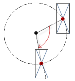
Rotation |
Variable (numeric data type). Defines the angle of rotation (in degrees). Example: PLC_PRG.iAngle1.
The midpoint of the element rotates at the Center point. This rotation point is shown as the In runtime mode, the alignment of the element remains the same with respect to the coordinate system of the visualization. Increasing the value rotates the element to the right. |
|
|
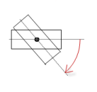
Interior rotation |
Variable (numeric data type). Defines the angle of rotation (in degrees). Example: PLC_PRG.iAngle2. In runtime mode, the element rotates about the point of rotation specified in Center according to the value of the variable. In addition, the alignment of the element rotates according to the coordinate system of the visualization. Increasing the value in the code rotates clockwise.
The rotation point is shown as the Note: If a static angle of rotation is specified in the Position ‣ Angle property, then the static angle of rotation is added to the variable angle of rotation (offset) when the visualization is executed. |
|
Note
You can link the variables to a unit conversion.
Note
The X, Y, Rotation, and Interior rotation properties are supported by the "Client Animation" functionality.
See also
Element property 'State variables'
The variables control the element behavior dynamically.
|
Invisible |
Variable (BOOL). Toggles the visibility of the element. TRUE: The element is not visible at runtime. |
|
Deactivate inputs |
Variable (BOOL). Toggles the operability of the element. TRUE: User inputs do not have any effect in runtime more. The element is shown as deactivated. |
Note
The Invisible property is supported by the "Client Animation" functionality.
See also
Element property 'Radio button settings'
|
Radio button
|
Create new: Clicking this button creates a new selection button in the editor and lists an additional area in the properties editor. For each radio button, an area is visible that records the settings.
|
|
Areas: [<n>] |
|
|
Text |
The button name is specified here. Default value: Radio_button |
|
Tooltip |
Text is specified here that is displayed in a tooltip. |
|
Line spacing (in pixels) |
The distance (in pixels) to the upper button can be specified here. |
These properties are available only when you select the Preview: Support client animations and overlay of native elements option in the Visualization Manager.
You can animate a movement, a rotation, and the visibility of a visualization element.
|
Animation time |
Time that the element executes an animation (in milliseconds) Example: 500 |
|
Move to the foreground |
Property value (BOOL) TRUE: At runtime, the element is displayed in the foreground. FALSE: At runtime, the element is displayed in the layer where it was inserted in the visualization editor. |
See also
Element property 'Access rights'
Requirement: User management is set up for the visualization.
|
Access rights |
Opens the Access rights dialog. There you can edit the access privileges for the element. Status messages:
|
See also
 : The
: The  : Drop-down list with style fonts.
 symbol.