Visualization Element 'SpinControl'

Tag: Common controls
The element increments or decrements the value of a variable in defined intervals.
|
Element name |
Example: Speed controller conveyor belt Optional Hint: Assign individual names for elements so that they are found faster in the element list. |
|
Type of element |
SpinControl |
The position defines the location and size of the element in the visualization window. These are based on the Cartesian coordinate system. The origin is located at the upper left corner of the window. The positive horizontal x-axis runs to the right. The positive vertical y-axis runs downwards.
|
X |
X coordinate of the upper left corner of the element Specified in pixels. Example: 10. |
|
Y |
Y coordinate of the upper left corner of the element Specified in pixels. Example: 10. |
|
Width |
Specified in pixels. Example: 150 |
|
Height |
Specified in pixels. Example: 30 |
Note
You can also change the values by dragging the box symbols ( ) to other positions in the editor.
See also
The properties contain fixed values for the coordinates of the point of rotation. This point of rotation is shown as the  symbol. The point is used as the center for rotating and scaling.
|
X |
X-coordinate of the point of rotation |
|
Y |
Y-coordinate of the point of rotation |
Note
You can also change the values by dragging the symbols () to other positions in the editor.
|
Variable |
Variable (numeric data type) Beispiel PLC_PRG.iTemp |
|
Number format |
Format of the value in printf syntax Example: %d, %5.2f |
|
Interval |
Interval used for modification of the value |
Element property 'Value range'
|
Minimum value |
Lower limit of the output value
|
|
Maximum value |
Upper limit of the output value
|
Element property 'Text properties'
The properties contain fixed values for the text properties.
|
Usage of |
|
|
Individual text properties Requirement: The Individual settings text property is defined. |
|
|
Horizontal alignment |
Horizontal alignment of the text within the element. |
|
Vertical alignment |
Vertical alignment of the text within the element. |
|
Font |
Example: Default
|
|
Font color |
Example: Black
|
|
Transparency |
Whole number (value range from 0 to 255). This determines the transparency of the respective color. Example: 255: The color is opaque. 0: The color is completely transparent. Please note: If the color is a style color and already has a transparency value, then this property is write-protected. |
Element property 'Colorvariables'
The Element property is used as an interface for project variables to dynamically control colors at runtime.
|
Toggle color |
The property controls the toggled color at runtime. Value assignment:
Assigning the property:
|
Note
The transparency part of the color value is evaluated only if the Activate semi-transparent drawing option of the visualization manager is selected.
Note
Select the Advanced option in the toolbar of the properties view. Then all element properties are visible.
See also
Element property 'Absolute movement'
The properties contain IEC variables for controlling the position of the element dynamically. The reference point is the upper left corner of the element. In runtime mode, the entire element is moved.
|
Movement |
||
|
X |
Variable (numeric data type). Defines the X position (in pixels). Example: PLC_PRG.iPos_X. Increasing this value in runtime mode moves the element to the right. |
|
|
Y |
Variable (numeric data type). Defines the Y position (in pixels). Example: PLC_PRG.iPos_Y. Increasing this value in runtime mode moves the element downwards. |
|
|
Rotation |
Variable (numeric data type). Defines the angle of rotation (in degrees). Example: PLC_PRG.iAngle1.
The midpoint of the element rotates at the Center point. This rotation point is shown as the In runtime mode, the alignment of the element remains the same with respect to the coordinate system of the visualization. Increasing the value rotates the element to the right. |
|
|
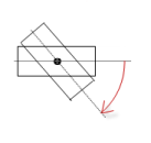
Interior rotation |
Variable (numeric data type). Defines the angle of rotation (in degrees). Example: PLC_PRG.iAngle2. In runtime mode, the element rotates about the point of rotation specified in Center according to the value of the variable. In addition, the alignment of the element rotates according to the coordinate system of the visualization. Increasing the value in the code rotates clockwise.
The rotation point is shown as the Note: If a static angle of rotation is specified in the Position ‣ Angle property, then the static angle of rotation is added to the variable angle of rotation (offset) when the visualization is executed. |
|
Note
You can link the variables to a unit conversion.
Note
The X, Y, Rotation, and Interior rotation properties are supported by the "Client Animation" functionality.
See also
Element property 'State variables'
The variables control the element behavior dynamically.
|
Invisible |
Variable (BOOL). Toggles the visibility of the element. TRUE: The element is not visible at runtime. |
|
Deactivate inputs |
Variable (BOOL). Toggles the operability of the element. TRUE: User inputs do not have any effect in runtime more. The element is shown as deactivated. |
Note
The Invisible property is supported by the "Client Animation" functionality.
See also
These properties are available only when you select the Preview: Support client animations and overlay of native elements option in the Visualization Manager.
You can animate a movement, a rotation, and the visibility of a visualization element.
|
Animation time |
Time that the element executes an animation (in milliseconds) Example: 500 |
|
Move to the foreground |
Property value (BOOL) TRUE: At runtime, the element is displayed in the foreground. FALSE: At runtime, the element is displayed in the layer where it was inserted in the visualization editor. |
See also
Element property 'Input configuration'
The properties contain the configurations for the user input when using the mouse or keyboard. User input is a user event from the perspective of the element.
Note
The input configuration refers to the text area of the element only, not the two buttons.
|
The Configure button opens the Input configuration dialog box for creating or modifying a user input configuration. A configuration contains one or more input actions for the respective input event. Existing input actions are displayed below it.
Example: Execute ST code: |
|
|
OnDialogClosed |
Input event: The user closes the dialog box. |
|
OnMouseClick |
Input event: The user clicks the element completely. The mouse button is clicked and released. |
|
OnMouseDown |
Input event: The user clicks down on the element only. |
|
OnMouseEnter |
Input event: The user drags the mouse pointer to the element. |
|
OnMouseLeave |
Input event: The user drags the mouse pointer away from the element. |
|
OnMouseMove |
Input event: The user moves the mouse pointer over the element area. |
|
OnMouseUp |
Input event: The user releases the mouse button over the element area. |
See also
|
Tap |
When a mouse click event occurs, the variable defined in Variable is described in the application. The coding depends on the options Tap FALSE and Tap on enter if captured. |
|
Variable |
Variable (BOOL). Contains the information whether a mouse click event exists. Example: PLC_PRG.bIsTapped TRUE: A mouse click event exists. It lasts while the user presses the mouse button over the element. It ends when the button is released. FALSE: A mouse click event does not exist. Requirement: The Tap FALSE option is not activated. |
|
Tap FALSE |
TRUE: A mouse click event does not exist. FALSE: While the mouse click event exists. |
|
Tap on enter if captured |
TRUE: While the mouse click event exists and the mouse pointer is moved over the element area. FALSE: A mouse click event does not exist. Or the user moves the mouse pointer outside of the element area while the mouse button is pressed. The value is TRUE again as soon as the user moves the pointer back to the element area. The mouse is then captured. |
|
Shift |
When a mouse click event occurs, the variable here is described in the application. When the mouse click event ends, its value is toggled with the Toggle on up if captured option. |
|
Variable |
Variable (BOOL). Its value toggled when the mouse click event is ended. This is when the user releases the mouse button while the mouse pointer is over the element area. If the user releases the mouse button while the mouse pointer is outside of the element area, then the mouse click event is not ended and the value is not toggled. Tip: The user can cancel a started toggle input by dragging the mouse pointer out of the element area. |
|
Toggle on up if captured |
|
|
Hotkeys |
Keyboard shortcut on the element for triggering specific input actions. When the keyboard shortcut event occurs, the input actions in the Event(s) property are triggered. In this way, it is not the input action itself that leads to this input action, but the mouse input action. |
|
Key |
Key pressed for input action. Example: T Note: The following properties appear when a key is selected. |
|
Event(s) |
|
|
Shift |
Example: Shift+T. |
|
Control |
Example: Ctrl+T. |
|
Alt |
Example: Alt+T. |
Note
All keyboard shortcuts and their actions that are configured in the visualization are listed in the Keyboard configuration tab.
See also
Element property 'Access rights'
Requirement: User management is set up for the visualization.
|
Access rights |
Opens the Access rights dialog. There you can edit the access privileges for the element. Status messages:
|
See also
 : The
: The  : Drop-down list with style fonts.
 to insert the placeholder
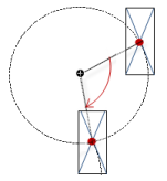
 : The mouse click event leads to a complementary value in