Displaying Array Data in Histograms
Setting element properties for histograms
Requirements
-
A project contains a visualization object and a program.
-
A one-dimensional array is declared in the program (example:
histogram : ARRAY[1...10] OF INT;). -
In the program,
histogramdata is assigned to the array (example: within the range from0to50).
-
Double-click the Visualization object in the device tree.
-
In the Toolbox view, click Measurement Controls and drag the Histogram element to the visualization editor.
-
In the visualization editor, click the inserted Histogram.
⇒ The Properties view opens.
-
In the Properties view, double-click the Value input field in the Data array element property. Then click
 .
.
-
In the Input Assistant dialog box in the Variables category of the PLC (PRG) program, select the array (example here:
histogram : ARRAY[1..10] OF INT;) and click OK. -
To display only part of the array as a histogram, activate the Use subrange option and specify the index values of the array in Start index and End index to define the subrange.
-
Select the Display type (example: Bar).
-
Specify a value between
1and100(example:30) for the Relative bar width. -
Click the histogram in the visualization editor and change the size and position as desired.
⇒ The Position property changes its values accordingly.
-
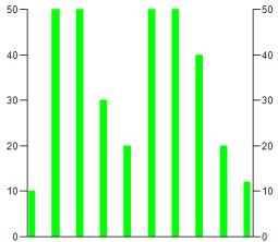
Specify the values for the Scale element property. Select the values for Scale start and Scale end so that the array is displayed completely. For the example: Scale start
0, Scale end50.For the distance between values on the rough scale, specify the value
10, for example, in Main scale. -
In the Label element property, specify the Unit for the display values.
-
Click .
-
If the project has been compiled without errors, then click and start the application by clicking .
⇒ The histogram is displayed in the visualization as follows:
Defining alarm colors for the histogram
The visualization shows a histogram with bars all the same color (example: green). Now you want the bars with values less than 30, for example, to be displayed in another color (example: red).
-
Click the element property .
-
Specify the limiting value in Alarm value above or below which the bars should be displayed in another color.
-
Select More from the drop-down list in Alarm condition if all values greater than the Alarm value should be displayed in another color. Otherwise, select Less.
-
Select an Alarm color (example: Red).
-
Click .
-
If the project has been compiled without errors, then click and start the application by clicking .
⇒ In the example histogram, all bars with values greater than
30are displayed in red.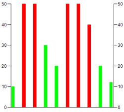
See also