Animating a Button
A button can change its appearance at runtime, as is usual with visualization elements. In this way, the element can move in a controlled manner, change color, or display different images. You animate this in the element properties. Movement is controlled in the Absolute movement and Relative movement properties. Color is controlled in the Color variables property. Image toggling is controlled in the Bitmap ID variable property.
In addition, a button can adopt the states "pressed" and "not pressed" and act like a switch or a push button. A switch toggles between pressed and not pressed. In contrast, a button or a push-button changes only briefly to "pressed" and is then again "not pressed". The Button state variable property controls how the states of buttons are seen. The property is coupled with user input by default.
Animating the button state
Define the input event to which a button responds by selecting an input event (mouse click event) under the Input configuration property. There you configure the action that is triggered.
Define the behavior of the button according to user input. When you assign a variable to the Input configuration, Toggle property, you configure a button that behaves like a switch. When you assign a variable to the Input configuration, Tap property, you configure a button that behave like a push button.
The Button state variable property controls whether the display of the button is pressed or not pressed. When you insert a button into your visualization, the property is assigned the placeholder <toggle/tap variable>. This has the effect that the display of the button reacts automatically to user input. When you specify a variable instead of the placeholder, you can program the display of the button yourself. In this way, you define when and how the button is displayed by setting the variable specified in the properties accordingly in the code.
Example
A visualization consists of the push button and a text field, which displays the number of button events.
If the push button detects a mouse click at runtime, then the color changes and the button is displayed as pressed. A counter variable is also incremented. After the mouse click, the button is blue again and not pressed. Moreover, the current variable value is permanently displayed in the text field. When the text field is clicked, the counter variable is set to zero.
Configuring push buttons with text output
-
Drag a Button element to the editor.
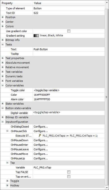
⇒ The Button state variable property is assigned the <toggle/tap variable> placeholder. Now the representation of the button is coupled with user input.
-
In the TextsText property, specify
Push Button -
Declare a program variable for user input and a counter variable for the follow-up action.
⇒
PROGRAM PLC_PRG VAR xTap: BOOL := FALSE; iCntTaps : INT := 0; END_VAR -
In the Input configuration, Tap, Variable property, specify the input variable.
⇒
PLC_PRG.xTapThe button has user input and is configured as a tap.
-
In the Input configurationOnMouseClick property, click Configure.
⇒ The Input Configuration dialog opens.
-
Select Execute ST code from the list of follow-up actions and click
 .
.
-
Input the following code into the editor:
PLC_PRG.iCntTaps := PLC_PRG.iCntTaps + 1;⇒ The button has a follow-up action. The counter is implemented.
-
In the Color variables, Toggle color property, specify the <toggle/tap variable> placeholder.
⇒ The property is coupled with user input via the placeholder. As soon as user input is detected, and therefore
PLC_PRG.xTapisTRUE, the color of the button changes.The button is configured:
-
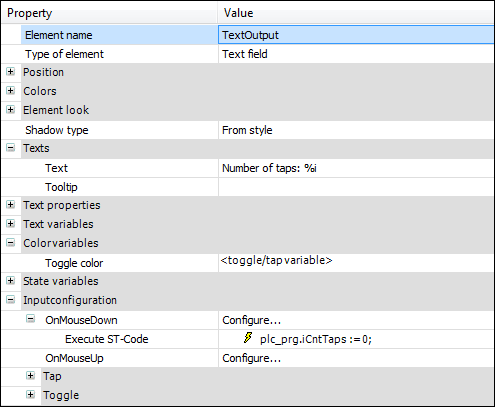
Drag a Text Field element to the editor.
-
In the TextsText property, specify
Number of taps: %i.⇒ The output text contains a placeholder for an integer variable.
-
In the Text variablesText variable property, specify
PLC_PRG.iCntTaps.⇒ At runtime, the placeholder is set and the variable value is shown instead.

-
In the Input configurationOnMouseClick property, click Configure.
⇒ The Input Configuration dialog opens.
-
Select Execute ST code from the list of follow-up actions and click
.
-
Input the following code:
PLC_PRG.iCntTaps := 0;⇒ The reset of the counter is implemented as the follow-up action.
The text field is configured.
See also