Node diagrams and the Designer interface
This section describes the components of the Designer interface and of node diagrams.
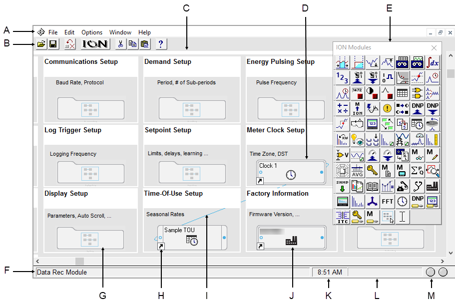
|
| A | Menu bar | B | Toolbar | C | Workspace with open node diagram | D | Core module (indicated by double border) |
| E | Toolbox | F | Status line | G | Grouping object | H | Shortcut icon |
| I | Module link | J | Module icon | K | Time display | L | Progress indicator |
| M | Communication status lights | ||||||
The Designer interface
The Designer interface consists of a main screen with a title bar, a menu bar, a toolbar, a workspace, and a status bar. When in Edit mode, the ION Modules toolbox is also displayed.
Title bar
The title bar displays the name of the program, the user name, and the name of the active node diagram.
Menu bar
Below the title bar is the menu bar. Click on a menu name to display a list of available commands.
Toolbar
The Toolbar offers quick access to the commands used most frequently. Each command offered on the toolbar is also available from the menu bar.
| A | Open |
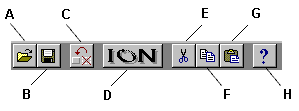
|
E | Cut |
| B | Save | F | Copy | |
| C | Reset | G | Paste | |
| D | Create a link | H | Help |
When you point at a toolbar button, a description of it appears in the status bar at the bottom of the screen and on a small ToolTip beside the button.
Workspace
The main area in the center of the screen is the workspace, where you view and edit node diagrams.
Status bar
The status bar displays status information. The components, from left to right, are:
- Status line: Describes any active processes and provides brief descriptions of the currently selected command or toolbar button. For example, when you move the pointer over a toolbar button or click on a menu name, a brief description of the item appears in the status line.
- Time display: Displays the current time on the workstation.
- Progress indicator: Depicts the progress on an action being performed.
- Communication status lights: Indicate if Designer is currently receiving and transmitting data on the Power Monitoring Expert network.
The node diagram
A node diagram is a graphical representation of an ION-compliant node. The node diagram displays the actual configuration of the node. Module icons represent the ION modules in the node, while lines drawn between these module icons show links between the ION modules.
In some cases, groups of modules are organized inside grouping windows. When closed, a grouping window appears as a grouping object (an icon that looks like a folder). Click a group object to open the grouping window that contains the module icons.
Using a node diagram
The node is graphically displayed as a node diagram in Designer. The node diagram contains a number of ION modules, which represent the node's current configuration. You can change the configuration of the node simply by editing its node diagram. For example, when you delete a module from a node diagram, the module is removed from both the diagram and the node. You can add, configure, link and delete modules on the node by making the corresponding changes to the module icons in the node diagram. A module’s setup registers can be accessed and changed through the module icon.
Use Designer to configure hardware nodes (for example,
notice
LOSS of data
Do not leave hardware or software nodes open in Designer, as this stops log downloads from the device.
Failure to follow these instructions can result in permanent loss of data.
Default node diagrams in Designer
When a meter is opened in Designer, the default diagrams for the appropriate meter and default template are loaded automatically.
Opening a node diagram
- Select File > Open to open the Select Node dialog.
-
Select the node you want to open then click OK.
When you select a node from the list, Designer communicates with the specified node and opens the applicable node diagram.
notice
unintended device operation
Do not open a node diagram if the node is currently being configured from its front panel.
Failure to follow these instructions can result in unplanned configuration changes.
When Designer loads a node diagram, it compares the diagram with the configuration of the node. If there are any discrepancies between the diagram and the node, Designer updates the diagram to match the node:
- If a diagram depicts a module that does not exist on the node, Designer deletes the module icon from the diagram.
- If a node contains a module that is not depicted in the diagram, Designer adds the module icon to the diagram.
- If the links between modules differ from node to diagram, Designer adjusts the diagram to match the node.
A node diagram typically does not differ from the node's true configuration unless the node's configuration was changed through other means (for example, with a remote display unit.)
Saving a node diagram
Saving a node diagram serves two purposes: it saves your changes to the diagram, and applies your changes to the node.
- To save the active node diagram, select File > Send & Save.
- To save all open node diagrams, select File > Send & Save All.
Closing a node diagram
To close the node diagram(s):
- Select File > Close to close the active diagram, or
- Select File > Close All to close all open diagrams and windows.
If you attempt to close a diagram without saving your changes, Designer displays a message with a list of the modules affected.
You can then do one of the following:
- Click OK to return to the diagram and save your work before closing the diagram.
- Click Close Anyway to discard any unsaved changes and close the diagram.
NOTE: If you reopen a diagram containing unsaved changes, Designer may list the unsaved changes as offline modules.
Display mode versus Edit mode
There are two display modes in Designer, which affect how you navigate a node diagram. Whether or not the toolbox is shown indicates the mode you are in: if the toolbox is open, you are in edit mode; if it is closed, you are in display mode.
Display mode allows you to view the node diagram without making changes. To prevent accidentally moving or deleting modules or links, use Display mode when navigating node diagrams. In Display mode, single-click grouping objects to open associated grouping windows.
Edit mode allows you to configure the node and the appearance of the node diagram. In Edit mode, double-click grouping objects to open associated grouping windows. Right-click objects or icons to view configuration options.
For more information on the Toolbox, see Using the ION modules toolbox.
Designer shortcuts
Designer provides several shortcuts to assist in programming the nodes.
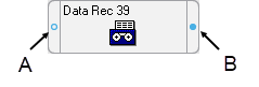
| A | Input |
| B | Output |
The following table lists the different mouse and keyboard combinations you can perform on a module’s input or output symbols, and their corresponding functions:
| Action | Result |
|---|---|
| Left-click input | The list of inputs appears - you can select an input and link it to another module's output register |
| SHIFT + left-click input | The list of inputs appears with the current input values displayed in square brackets |
| Right-click input | The Delete Links dialog appears - you can break links from this dialog. |
| SHIFT + right-click input | The Delete Links dialog appears, showing inputs and current input values in square brackets |
| Left-click output | The list of output registers appears |
| SHIFT + left-click output | The list of output registers appears with the current register value displayed in square brackets |
| CTRL + left-click output | The list of setup registers appears - these setup registers can be linked to inputs on other modules |
| SHIFT + CTRL + left-click output | The list of setup registers appears with the current register settings displayed in square brackets |
| Right-click output | The list of output register owners appears - you can break links from this dialog |
| CTRL + right-click output | The list of setup register owners appears - you can break links from this dialog |
NOTE: To create a shortcut to an ION module, see Creating a shortcut to an ION module.
Designer icons
In each node diagram, Designer uses icons to represent the configuration of the node. There are two basic types of icons: module icons and grouping icons.
Module icons represent ION modules located on the node. Grouping icons represent a group of module icons.
NOTE: A module icon with a symbol  in the lower corner is a shortcut.
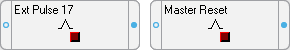
Module icons
All module icons share four common elements: a label, a graphic, an input symbol and an output symbol.
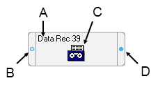
| A | Label | C | Graphic |
| B | Input Symbol | D | Output Symbol |
- The label displays the name of the module.
- The graphic shows a picture to distinguish one type of module from another.
- The input and output symbols provide access to the module's input and output registers. Click the left symbol to display a list of inputs; click the right symbol to display a list of output registers. See Linking ION modules for more information.
Module icons with a double border represent core modules; module icons with a single border represent standard modules. For more information on core and standard modules, see Core modules and standard modules.
Grouping icons and grouping windows
Grouping icons represent grouping windows. Click a grouping icon (left) to open its associated grouping window (right).
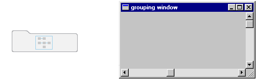
A grouping window acts as a folder or sub-window where you can store icons that you want to keep together. For example, you can use grouping windows to group module icons by application—a single grouping window may contain all module icons required for demand or advanced setup routines.
You can use a grouping window much like a standard window. You can create, rename or delete a grouping window; you can move a grouping window within a diagram, and you can move a module into or out of a grouping window.
When you finish editing the grouping window, close it to minimize the window to its corresponding grouping icon in the node diagram.
Opening a grouping window
Click on the grouping icon.
Closing a grouping window
Click the Close button  .
.
Moving icons into a grouping window
To move an icon (or group of icons) to or from an open grouping window, select it and drag it to the new location.
-
Click on a grouping icon to open the grouping window.
Drag the grouping window by the title bar and position it so that you can see the icon(s) that you want to move.
- Select the icon(s) you want to move and drag the selection into the grouping window.
When you move a linked module icon into a grouping window, the module remains linked but any lines that represent links to modules outside the window disappear.
Creating a new grouping window
To create a new grouping window, drag the grouping object  from the toolbox onto the node diagram.
The ION modules toolbox is a collection of ION modules and generic tools that you can add to a node diagram. If the ION modules toolbox is not displayed, select Options > Show Toolbox. See Using the ION modules toolbox for more information.
When you point to an object in the toolbox, the name of the object is displayed on a ToolTip. You can use ToolTips to identify the grouping object in the toolbox.
Renaming a grouping window
When you create a new grouping window, the default name is that of the node diagram. To change the name of a grouping window, rename the grouping icon:
- Right-click the grouping icon to open the Grouping Object Configuration dialog.
- Select Use Custom from the Caption section and type the new name into the text box.
- Click OK.
Changing the font of a grouping window
To change the font, font style and size of a caption:
- Right-click the grouping icon to open the Grouping Object Configuration dialog.
- In the Font section, do one of the following:
- To use the font of the parent window, select Inherit from parent window.
- To use a different font, select Custom, then click Font to open the Font dialog. Select the font options you want then click OK to continue.
- Click OK.
Changing the position of the caption
To change the location of the caption:
- Right-click the grouping icon to open the Grouping Object Configuration dialog.
- Select either Top or Bottom in the Position section to specify a caption position above or below the grouping icon.
- Click OK.
Deleting a grouping window
NOTE: When you delete a grouping window, any modules inside are deleted as well. Designer displays a message before deleting modules. See Deleting or cutting an ION module for more information on deleting modules.
- Select the grouping icon of the window you want to delete.
- Press the Delete key. If the grouping window contains modules, Designer displays a list of modules that will be deleted.
Displaying default or custom icon labels
Module icons can display two types of labels: Default (left) and Custom (right).
- Default labels: All modules have a default label. The default label identifies the module by type and, if applicable, by number. It appears in node diagrams, user diagrams and event logs unless a custom label is available.
- Custom labels: Custom labels are available only if they have been preconfigured by a user. A custom label usually identifies a module by its function or purpose. Custom labels are useful for describing modules, setup registers, output registers, and Boolean ON/OFF conditions. For information on adding custom labels, see Customizing a module label.
Displaying default labels or custom labels
Select Options > Show Default Labels to toggle the option on or off.
- When Show Default Labels is selected, default labels are displayed.
- When Show Default Labels is not selected, custom labels are displayed.
This is a global setting that applies to all node diagrams.
Moving icons in a node diagram
You can move module and grouping icons anywhere in a node diagram. This is useful for organizing your diagram (for example, by function or type) so that you can easily find a particular module or visualize the workings of your node's configuration. You can move a single icon or group of icons within a single node diagram, or into an open grouping window.
NOTE: Moving the icons in a node diagram does not affect the function of the modules or the node in any way.
Moving icons
-
Select the icon(s) you want to move.
When a grouping icon is selected, all icons within its grouping window are automatically selected as well.
- Drag the selected icon(s) to the new location.
NOTE: When selecting a group of icons, you can only choose icons from within the active window.
Arranging icons in a node diagram
You can use the Align and Grid options in the Layout dialog to adjust the spacing and layout of the module and grouping icons in your node diagram. Use the Align option to specify the horizontal and vertical arrangement of the selected icons and the Grid option to activate and configure invisible guidelines.
NOTE: Arranging the icons in a node diagram does not affect the function of the modules or the node in any way.
Changing the order of layered or stacked icons
If an icon appears on top of another icon that you want to bring to the front, select the icon that is sitting on top, then click CTRL+K (or click Edit > Send to Back).
Aligning icons
The Align tab in the Layout dialog allows you to specify the horizontal and vertical alignment of selected objects.
To align objects:
- Select the icons that you want to align.
- Select Edit > Layout to open the Layout dialog.
-
Select the Align tab and set the horizontal and vertical alignment of the icons.
The options in each area determine the criteria by which you can align icons. For example, if you select Left sides under Horizontal and Space evenly under Vertical, Designer aligns all objects in the selection by their left sides (using the leftmost object for reference) and distributes them evenly along a vertical axis.
- Click OK.
Using the grid
The Grid tab in the Layout dialog activates and configures an invisible grid. Icons placed onto the grid snap to the nearest gridline to help align and space them evenly.
To activate or deactivate the grid:
- Select Edit > Layout to open the Layout dialog.
- Select the Grid tab.
- Select one of the following options:
- No Grid turns the grid off.
- Grid size in pixels activates the grid. Type a number in the Grid size in pixels box to specify the size of the grid (distance between grid lines).
- Click OK to save your changes.
Designer windows
To create links between several node diagrams or grouping windows, you need to position the open windows so you can see all the modules involved. Use the Window menu to organize open windows in the workspace.
Arranging windows in your workspace
To arrange windows, do one of the following:
- To locate an open window and move it to the foreground, select the Window menu and select the window name from the list of open windows.
- To arrange all open windows in the workspace, select Window > Arrange All.
Changing a window’s background color
By default, the background color of all windows in a node diagram is light gray. To select a new background color for a window:
- Right-click the background of the window and select Background Color to open the Color dialog.
- Select the color you want or click Define Custom Colors for more options.
- Click OK.
When choosing a background color, consider how the color affects the visibility of icons and links. Links, highlights and shadow effects used to depict the various states of an ION module may not appear against certain background colors. For this reason, you should avoid using certain colors for your background, particularly white, dark gray and black.
Changing a window’s default font
You can specify a default font to be used for all module icons, grouping icons and text boxes in a window.
- Right-click the background of the window and select Default Font to open the Font dialog.
- Specify a new default font, size and style.
- Click OK.
Fonts can also be specified individually for grouping windows and text boxes. See Changing the font of a grouping window and Changing the font of a Text Box for more information.