Power Quality Performance Indicator diagrams
Overview
The Power Quality Indicator diagrams show several power quality indicators. Each indicator represents a different type of power quality event or disturbance. The indicators are color coded and provide more detailed information when clicked.
Diagrams
Power Quality Performance Indicator diagram is organized into 3 levels and a setup page:
- Landing page
- Details pages
- Information pages
- Setup page
1. Landing page
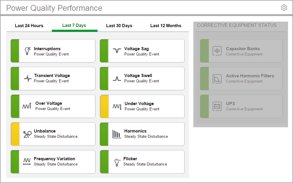
This page shows a high-level power quality summary. The landing page first opens to the LAST 7 DAYS viewing period. The other time periods are LAST 24 HOURS, LAST 30 DAYS, and LAST 12 MONTHS.
The indicators on the page are color-coded based on the state of the specific power quality item. The color classifications are defined by configurable limits, set for each item. The color coding indicates how well your system performed, with regards to power quality, over a certain period of time:
- Green means there are no power quality issues.
- Yellow means there are a few power quality issues, which might be investigated.
- Red means there are frequent power quality issues, which should be investigated.
To open the landing page:
In diagrams, click the grouping object that links to the page , or click the Power Quality Performance tab in the Web Applications banner. Which of these two options have been implemented depends on how your system has been configured.
Example landing page:

2. Details page
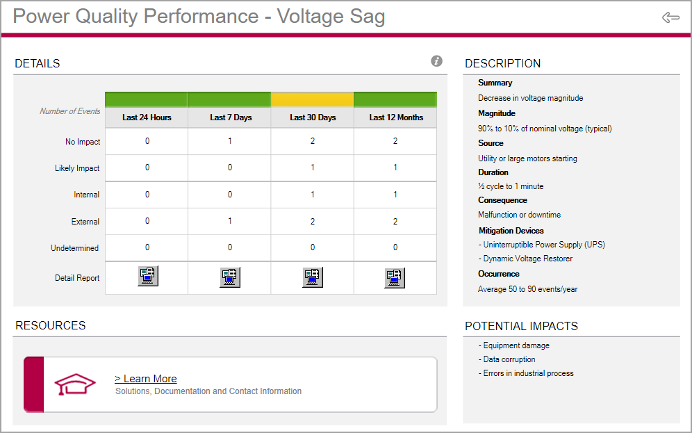
This page shows a breakdown of the specific event or disturbance, by time period. It provides the following details:
- Counts for events with No Impact and Likely Impact.
- Counts for events with Internal, External, and Undetermined origin.
- A log with event details.
The details page also includes a description of the event or disturbance type and potential impacts. There is a Learn More link to access additional, related information.
To open a details page:
On the landing page, click an event or disturbance to open the details page for that item.
Example details page:

3. Information page
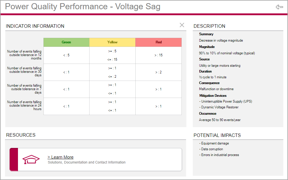
This page shows the color classification limits used to determine whether the event or disturbance is flagged with a green, yellow, or red color.
To open an information page:
On a details page, click the information icon ![]() . Click X to return to the details page.
. Click X to return to the details page.
Example information page:

4. Setup page
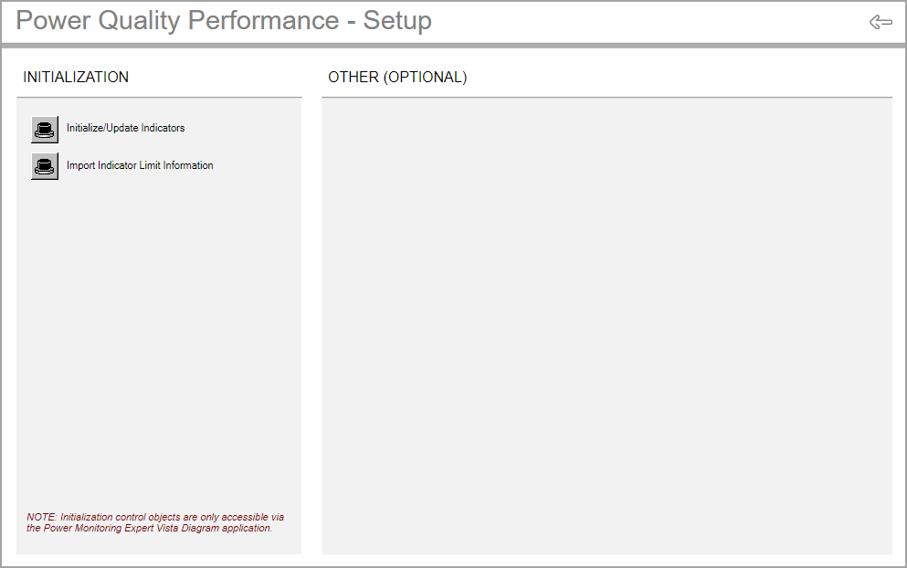
This page has controls to trigger an update of the power quality indicators and the indicator limits.
Use the Initialize/Update Indicators control to manually update all indicators in the Power Quality Performance diagrams. This triggers an immediate update instead of waiting for automatic updates (15 minutes to 1 hour).
Use the Import Indicator Limit Information control to update the Power Quality Performance indicator limits after the limit table in the database has been updated.
The OTHER (OPTIONAL) area is intended for custom controls. This area is empty by default.
To open the setup page:
On the landing page, click the Setup icon ![]() . Click the Back icon
. Click the Back icon ![]() to return to the landing page.
to return to the landing page.
Example setup page:

For details on the diagrams, see:
- Power Quality Performance Indicator diagrams
- Power Quality Performance Equipment diagrams
Related topics:
- The Diagrams user interface
- User authentication
- Viewing historical (trend) data
- Viewing meter events
- Viewing user diagram of devices with security
- Stale data and error indicators
- Power Quality Performance diagrams
- Insulation Monitoring diagrams
- UPS Auto Test diagrams
- EPSS diagrams
- Breaker Aging diagrams
For information on how to configure Diagrams, see Diagrams and graphics configuration.